


14.11.25/9.12.25
1. Difference between black and white
First black and white.
It will be even more interesting in the next chapters on “color”.
What comes out? “An image minus the same image”? Minuend minus identical subtrahend?
The first thought is: this is a useless procedure!
If you subtract identical numerical values thousands of times, pixel by pixel, you have to get the same result thousands of times: zero.
This difference image will be completely black; there will be no contrast, no structure, not even statistical noise.
But two small deviations in these subtraction conditions can produce impressive effects.
We focus on the following modifications:
The subtrahend differs from the minuend only in sharpness
1. unsharp
2. in addition, it is (slightly) shifted compared to the original = “pseudorelief”.
4 groups of images were examined:
- natural objects
- subtraction of colors
- architecture
- people, communication
“black minus white”?
Some theoretical considerations: white minus white = minuend – subtrahend = +a minus +a = 0 = black.
There is a challenge in this banal statement:
What happens with “black – white”?
The result should be: minus white.
This result is nonsensical; because light is a positive information compared to darkness. A negative image (or negative pixel) you would have to add light to get darkness; that would be paradoxical. Light must be measurable and describable as a positive numerical value.
The harmless arithmetic operation of subtraction can already produce absurd values.
For a practical investigation that ultimately produces presentable images rather than virtual ones, we need an (arbitrary) definition of how to deal with these negative numerical values. One possibility would be:
1. Discard images with negative numerical values as nonsensical.
2. Evaluate everything that goes into the minus range as black (= zero). Even if the value is below 0!
(a is then no longer a).
3.Ignore the minus sign and display negative values as positive; a pragmatic but – just like solution 2 – mathematically incorrect solution. Nevertheless, it is used by common programs; and we will demonstrate this procedure below!
In other words, we limit ourselves to the absolute value; the sign is no longer considered. You could also say that the minuend and subtrahend are swapped; this turns a negative result into a positive one; the absolute value remains the same.
Let’s try working with version 3, even if it’s a bit of a stretch for mathematicians.
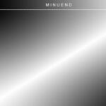
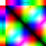
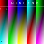
Abb.1 Minuend und Subtrahend sind als Schwarz-Weiß-Gradienten dargestellt.
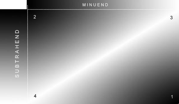
In the result rectangle:
Typical regions 1 – 4
- 1 White – White = Black
- 2 Black – Black = Black
- 3 White – Black = White
- 4 Black – White = White (the actual surprise!)
So subtraction often produces unrealistic image information;
but on the other hand, one could also say that these are positive “virtual” images. The term “virtual” suggests something “imperfect”, something that exists only “as a possibility”. These are images that contain information that is initially hidden. What is initially incomprehensible can be
(See Paul Gelinsky: Die Deutung des Röntgenbildes. Frieling, Berlin 2005.)
We are not interested in exact measurements, but in a play with brightness and colors:
there it is of practical use,
– white in + white to “conjure”.
This approach is not useful for all applications;
(see also: W.G.H. Schmitt, O.M. Mahmalat and M. Medrea: “Subtraction in imaging techniques”, Medizinische Welt 42 (1991) 278-84).
After these considerations on the black-and-white problem, some images should be shown and then, in the second chapter, the “subtraction of colors” should be discussed.
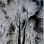
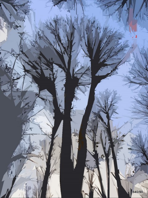
Fig. 1a: Trees.
Make the image look aesthetic.

It has a poignant contrast, an intense plasticity. It seems to break through the two dimensions and penetrate into the third. Such images, in which one has accepted the reality, quickly seem eerie, strange and mysterious.
Not everything in this picture is “physically exact”; but we allow ourselves to use the technical possibilities (including the means of alienation) to create the illusion of space.
Outlook on our method to be presented here:
The image and the negative of this image are “superimposed” ( = subtraction));
At first, the result is disappointing! We produce a large dark area.
A miracle occurs with just a small trick:
If the one image (with the arithmetic operations that Gauss demonstrated to us) is made unsharp, the result is a wealth of structures! Suddenly we get an image of blurring (?); or is it an image of sharpness?
We combine this effect with a second one: Slight displacement of one of the images (e.g. the 2nd blurred image to be subtracted) in a certain direction.
We do not do anything else! Otherwise the procedure becomes confusing and convoluted. Otherwise the processing becomes an “equation with too many unknowns”.
We will come to the details later.
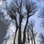
Fig. 1b: Same original, edited with a common, professional program, “color paper”
A large proportion of viewers find this method interesting. –
We would like to compare our experiments with such professional programs. Photoshop products are very popular and well-regarded for good reason.
The main topic is our own method (as presented in 1a);
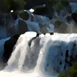
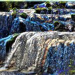
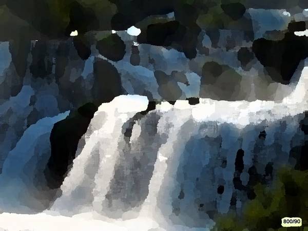
Figure 2a: Waterfall at the Krka River in Croatia; commercial Photoshop program

The deliberately rough structuring distances the image from reality, but an artistic effect is achieved.
Anyone who has seen this natural spectacle will confirm that the impression of falling water is well reproduced, despite the very rough simplification.
This editing reduces storage space as a side effect.
Fig. 2b: Our method of processing is not without artistic appeal either.
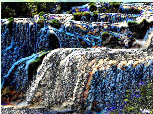
The impression of the falling river is captured vividly.
The Gaussian blur was small (size: 4); slight shift of the second blurred image to the right and significant shift (about 10 pixels) downwards.
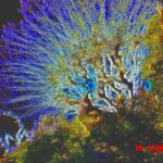
Fig. 3: Backlit bush in Haut de Cagnes, Cote d’Azur, France
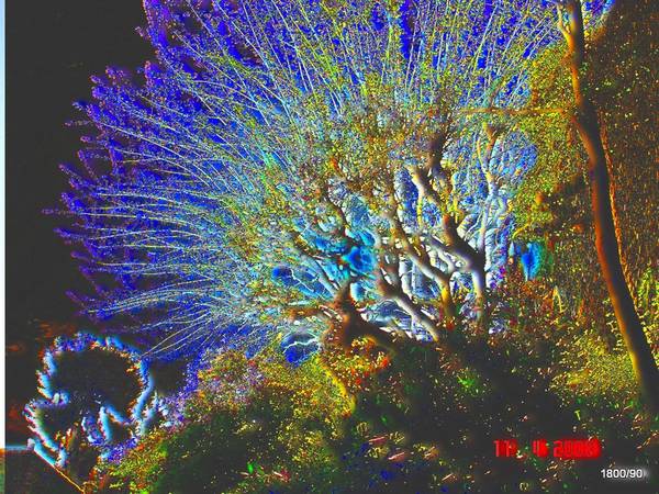
Our method was applied: The second image (subtrahend) is only moderately blurred (level 6) and slightly shifted to the right/top.
Typical representation: The large light areas such as the sky become “deep black” with this method (white – white = zero = black).
The large black areas, tree trunks and shadows in the foreground also become “black” (black minus black remains black).
The small structures are intensely emphasized. Strange color changes: This “blue” is not present in the original at all. The displacement creates a one-sided, emphasized, “apparent illumination” of the coarse branches and trunks.
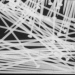
Fig. 4a: X-ray image of needles in a box.
The tiny steel rods are surrounded by air, which creates particularly strong contrasts.
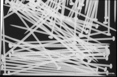
Let us start with the theory using this object,
(or jump ahead to Figure 7 if the model seems “boring” to you).
Figure 4b: The same image, but blurred, has been subtracted from this X-ray image. (No displacement of the two images here)
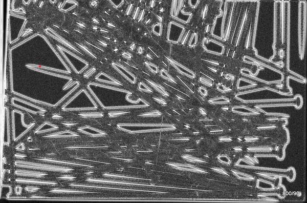
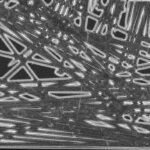
Fig. 4c: Schematic: Profile A minus Profile B = Result C.
However, the minus values in C are flipped into the positive.

Let’s take another close look at the resulting image (Fig. 4b):
– The black background remains black; the light needles change from light to dark gray.
– The special feature lies in the edge contours, the border lines between white and black. Here a very sharp black line is created (see e.g. red asterisk),
inside and outside the sharp black line is surrounded by a blurred light seam.
This light seam fades out in the surrounding area, but also moves into the needle surfaces.
In the early 80s, an article was found in an American journal that applied this procedure in the film laboratory. The purpose was to improve the visibility of structures within very dark or very light areas on chest X-rays. Who can help me with my search?
The profile is the brightness along a line. Of course, two profiles can also be subtracted and then have a result profile C. A-B = C
The sharp profile (A) – the blurred profile (B) gives the difference (C). But be careful: it is not the mathematical difference, but the difference of the amounts; “negative values in the result” are flipped into “plus”. It would have been more exact if we had shown:
- C mathematically and
- C as it appears in our pictures
Conclusion: In our treatment, all f l a c e s (darkened and thus) suppressed;
But the separating lines between light and dark, or, to put it simply, the structural elements, are pointedly emphasized.
If you were now to additionally slightly shift the two images against each other, a “pseudo-relief” would arise: the needles would get a light seam on one side and a dark one on the other. This will be demonstrated in a few examples (starting with Fig. 6).
The examples of subtraction of colored images have long shown that peculiar changes in colors occur during this process. These will be systematically examined in the following.
2. Difference of one color from the other color
Colorants (painting agents) versus real color
Sir I. Newton explained the “colors” and ingeniously simplified the problem:
‘“White” can be split into a color spectrum using the prism and
the spectrum can also be reunited into white.
We perceive white and the colors in our heads. Only in our perception do there exist colors. In the pot or tube, there are no “colors,” but rather “painting materials” or “colorants.”
In English, this distinction exists between ‘color’ and ‘paint’ and is very helpful. Newton has done a great job, but the millions of people who have shaped the English language have done a great deal of preparatory work.
The paint medium is not second-rate; it does something great:
it swallows, absorbs, subtracts
certain portions of the spectrum and reflects others.
Let’s remember: paint mixing is always “subtractive”!
In contrast, the merging of real colors (according to Newton) is described as “additive”.
Everyone knows that there is a big difference:
Additive mixing of all spectral colors makes white;
subtractive mixing, on the other hand, makes brown/black. But this method of mixing is useful in everyday life.
Additive mixing inevitably leads to the question: what does the rest of the light look like when we remove “something” from the spectrum?
We may expect that the reverse is also true: removing the “rest” will result in the original.
These are the complementary colors; they combine to form white.
Red and green,
orange and blue,
yellow and violet.
One ambiguity remains with the “subtraction” that is typical for all painting media. It does not quite correspond to our subtraction of colors and images!
– Subtraction in the various painting media means
(something or everything) swallowing;
but of course only what is also irradiated;
absorption goes down to zero, but never below zero.
Our subtraction of images with the computer theoretically has negative values; in practice, we avoid it by (meaningful) agreements. We make a + out of a –; this results in an idiosyncratic combination of subtraction and addition.
You could also put it this way:
We are only interested in the absolute value and neglect the sign. Or to put it another way: we swap the minuend and the subtrahend.
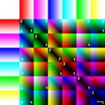
Figure 5a: This diagram illustrates the subtraction of colors.
The rectangles in the top row are the minuend.
Each of the 6 colors transitions continuously into “white” (gradient).
What is meant by “transitioning into white”: In each box, the remaining spectral colors are increasingly added from left to right until all are evenly represented = white.
(White = a mixture of all spectral colors).
In the vertical bar on the far left, the subtrahend is arranged and identically composed.
The 36 squares are the results.
For interpretation, we first note the
(partly marked with “1”) lower right corner of all 36 squares:
Everywhere “black”.
In this area, white is subtracted from white, nothing remains, so it is “black”. This is most noticeable in the area of the diagonal, from the upper left to the lower right.
But in all the other boxes, we also find “darkness” in the lower right corner.
Why?
Because there, too, white is subtracted from white = black.
“2” marks the area in the upper left corner of some squares, namely those of the “diagonal”.
Why do we have “black” here again?
Different colors are subtracted from the same color. Result = zero = black.
Let’s look at the upper right corners of the squares. First, only the top row of results, marked “3”.
The result is uniform: a cyan tone,
Why is there a uniform result in the upper right corners of all the squares in this row?
In all cases, orange/red was subtracted from white.
Let’s look at the lower left corners of the result boxes.
First, in the column on the far left, marked “4”.
This corner always has the same results. Why?
Orange/red was always subtracted from “white”,
so the same result (a cyan shade) is always obtained.
In these “4” corners, the results are always the same in the vertical direction. (In the “3” corners, the horizontal lines were always the same).
We are not experts in the exact mixing of the color spectrum and in the representation of highly purified components. We just want to demonstrate three things:
– White minus white is black (see “1”)
– White minus color produces a change in color through a mixture of the remaining parts of the spectrum. (ideally: complementary colors!)
– Color minus white also produces a totally new result (see all the upper right corners “3”). Here, too, we can ideally expect complementary colors. They are negative, but are made visible. It’s a paradox, but it’s pragmatic.
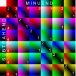
Fig. 5b: In this subtraction scheme, the 6 colors are also identical in both the minuend and the subtrahend. What has been changed?

It differs from the previous Fig. a in one point only.
Each color has a gradient not towards white but towards black. To put it more precisely: In 5a, each color was mixed with the other complementary colors to saturation = white.
In this case (5b), each color is progressively reduced to zero = black.
The scheme of the result squares is analogous to 5a; the four corners of the squares are also labeled identically:
lower right corner = black; black minus black remains black; both in the squares of the diagonals (labeled with a large “1”), as well as in all the other squares; (some are labeled with a small “1” as an example).
Color minus same color = black (“2”).
Black minus color remains color; identical in same rows (example “3”).
Color minus black remains color; identical in same columns (example “4”).
The diagonal as an axis of symmetry proves that negative values are displayed as positive.
Fig. 5c: Here, only colors are subtracted from colors. White is left out.

If the colors of the minuend and subtrahend are the same, the result is “black”: see the black diagonal from top left to bottom right.
Our colors are not pure. Color minus color apparently produces new results because common components are canceled out and the remaining components are displayed (mixed). The negative (remaining) components of the subtrahend are also included in the coloration. Apparently, there is a juxtaposition of subtractive and additive color phenomena. We observe these phenomena, but are not able to carry out an in-depth quantification.
Some examples are marked: Blue minus magenta results in a red tone in our example. Cyan minus blue a greenish tone. Green minus cyan a blue tone. Yellow minus green in our example red.
Fig. 5d: Minuend as in 5b; subtrahend as in 5d.

As expected, the left sides of the “result columns” do not change compared to 5d.
On the right sides of the result columns, black and white are swapped.
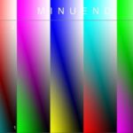
Fig. 5e: Minuend as in 5a, but a black-and-white gradient as the subtrahend.

Bottom right, within all result rectangles (“1”):
White – White = Black.
Top left (“2”): Subtracting black preserves the respective color.
Top right (“3”): Subtracting black yields “white” in all cases.
Bottom left (“4”): Subtracting different colors from white produces different new colors. The exact rules will not be discussed in depth.
3. Examples, Part 1 (Architecture and Structure)
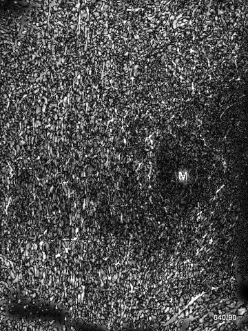
Fig. 6 Processing of an X-ray image (Fig. 2) from article 08 “Bone metastases” on this website.

The metastasis is marked with an “M” and shows a reduction in the bone trabeculae, but an increase in the structures at the margins.
It is possible that such edits are diagnostically helpful.
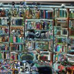
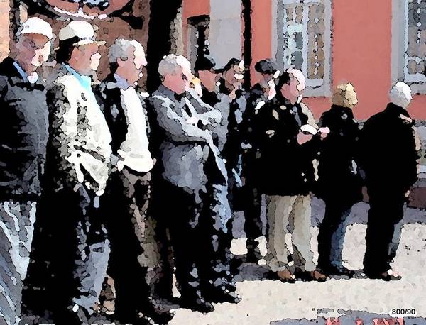
Fig. 7a: Bookcase; treated with a common program “painting knife”
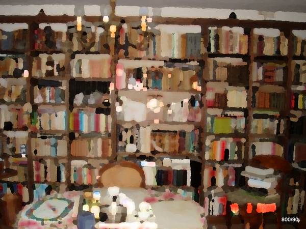
The image is reduced to a limited number of colored areas, but a vivid, even plastic impression remains.
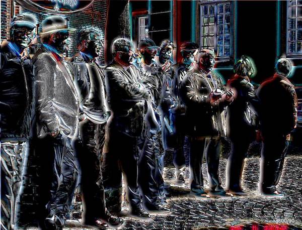
Fig. 7b: This is what the view looks like in our editing.
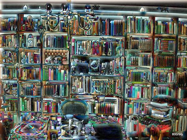
The blurred original (with a small shift to the right/down) is subtracted from the “sharp” original.
As a rule, small structures require a small Gaussian blur filter and a small shift.
Our method is not very suitable for objects that show very large, homogeneous areas; then the black areas created are too large.
It is well suited for heavily structured objects.
Additional color in the structures is appealing because it causes wild but interesting color changes.
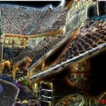
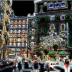
Fig. 8: Fortified Church in Mönchsondheim in Lower Franconia, Germany.
View from the courtyard of some of the numerous workshops located in the protection of the wall. Processed with our “difference method”.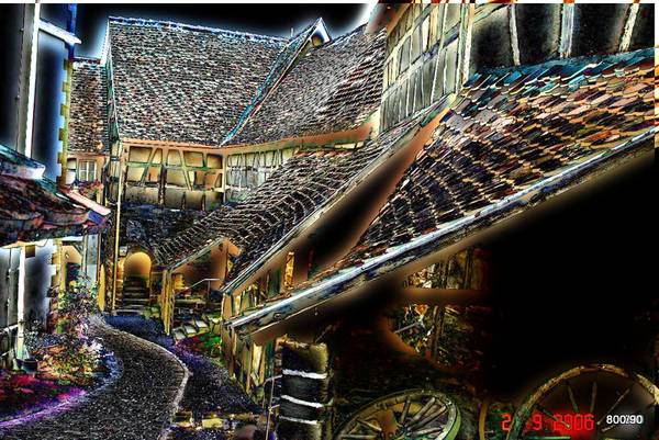
The original photo has strong structures, caused by roof tiles, half-timbering and paving stones. Therefore, it is suitable for processing with our method.
The factor for the “Gaussian blur” is relatively large; however, only a small shift to the lower left was performed.
In a typical way, the homogeneous surfaces of the sky and the shadows in the foreground turn “deep black”.
The roof tiles, on the other hand, take on a more intense structure and color, as do the wagon wheels and the pavement. The few flowers along the way bloom in fantasy colors through the processing.
You should not select any images with large homogenous areas for our process!
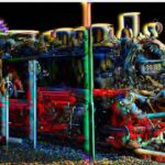
Fig. 9: The “Rasender Roland” locomotive on the island of Rügen in Germany.
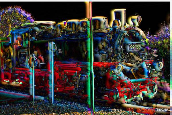
The blurred duplicate is heavily shifted to the left and down and then subtracted. You can see this strong shift at the edge of the image, but also, for example, at the chimney of the locomotive.
Since the object is very black anyway, it doesn’t matter if our image processing tends towards “black”. The machine’s fascination and eeriness is well expressed.
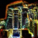
Fig. 10a: Temple of Kom Ombo (Greek: Omboi), Egypt
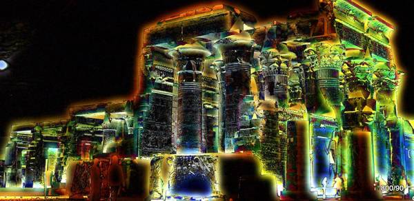
Wonderful Egyptian temple on the Nile between Edfu and Aswan.
The original photo shows the building illuminated at night (with moon). The processing in the subtraktons program does not stray too far from the original due to the dark sky and the dark shadows in the foreground. However, the processing suppresses the homogeneous surfaces of the architecture; the rich structures of the reliefs are emphasized.
The unconventional lighting intensifies the impression of mystery and unreality. Fig. 10a: Temple of Kom Ombo (Greek: Omboi), Egypt
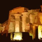
Fig. 10b: The same object edited with a professional program: “paper collage” (Photoshop).
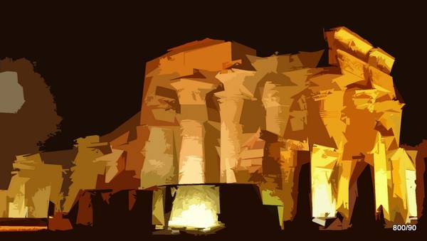
Compared to treatment “a”, this program respects the colors much better; the bizarre surfaces give a good impression of this colossus of a column. However, the fine structure is not taken into account at all but strongly suppressed.
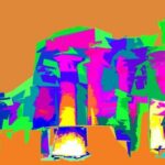
Fig. 10c: Based on 10b, further color manipulations
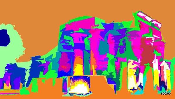
The form and color have been so radically altered that recognizability is lost. Despite the reduction to the essentials, the impression of a massive structure remains;
despite the alienation, it appears to us as something “made by human hands” (aedificium). Fig. 10c: Based on 10b, further color manipulations
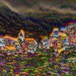
Fig. 11: One of the villages in the Cinque terre on the Italian Riviera (Liguria).
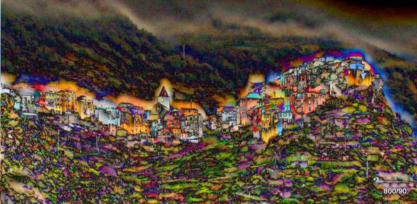
Our treatment (with a fairly significant shift of the blurred negative upwards) highlights the village. It reinforces the impression of a dwelling anchored on the hilltop like an eagle’s nest.
The foreground is colorful and restless, the background more balanced, which enhances a spatial impression of depth.
The image creates a mysterious mood. This is just one facet of this unusual landscape.
Fig. 12: Ochsenfurt am Main in Lower Franconia, Germany. Front row of houses with a view of the town hall
Our treatment: Gaussian blur (factor of 10) and slight displacement.
The sky, the street, and the balustrade with the female figure in the foreground recede completely into the darkness.
The image comes to life through the colorful, heavily textured building facade and the human figures seated in front of it.
Admittedly, the artist exposes himself to accusations of kitsch (due to the reversal of colors). But we like the radical focus on the details. It is possible through the consistent suppression of all homogeneity.
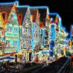
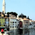
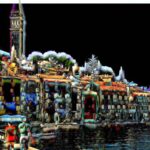
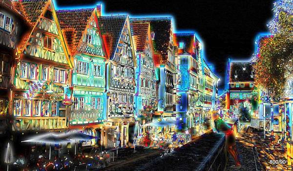
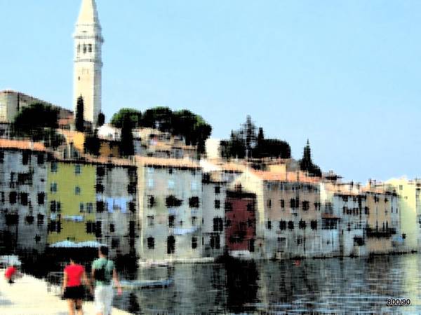
Fig. 13a: The small town of Rovinj on the west coast of Istria (Croatia).
The original is edited with a commercial program of Photoshop “damp paper”. Dark structures run in horizontal and perpendicular direction and thereby strengthen the mathematical network of the cityscape. –
Many similar programs imitate artistic processing: often there is a reduction to colored areas, which is an attempt to emphasize the essential. Other programs, as in the example, enhance lines and structures and seek the image characteristics in these.
Figure 13b: This town of Rovinj with our subtracted treatment:
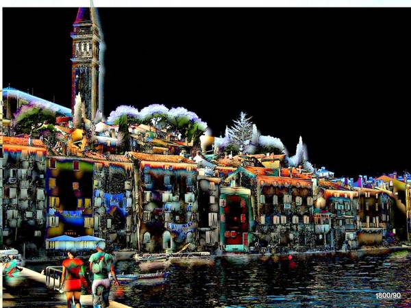
Here, too, the structure of the house silhouette is emphasized,
as are the two people in the foreground and the (shade-giving) trees.
The shifting of the blurred negative is comparatively strong: the image, which is mostly dark, acquires a few more light accents and thus a stronger spatial impression as a result of this shifting. When choosing your subject, you should perhaps make sure that the sky is not too homogeneous.
Fig. 14a: The Forest Cemetery in Darmstadt; partial aspect. (Architect: August Buxbaum 1919.)
This is what processing with a different program looks like: namely, with the interesting “color paper collage” that has already been demonstrated.
Here, the form and structure of the building are greatly reduced. The selection of the essential is not done by an artist, but by a mathematical program.
One could also ask, in a very simplistic way: can a computer program reduce the image information to one thousandth and still reproduce the architectural character well? Surprisingly, this original intention can be represented quite accurately.
Fig. 14b: Forest cemetery with our treatment: relatively strong displacement (pseudorelief) 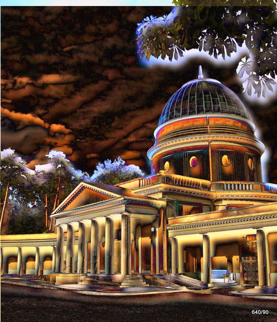
Die Bildfärbung wird nicht zu stark verändert; der bewölkte Himmel behält einen Rest von Struktur.
Die Darstellung entfernt sich deutlich von der Realität. Die Interpretation ist gewagt. Trotzdem wird der Charakter des Bauwerkes nach unserer Meinung gut erfasst.
4. Examples Part 2 (people, communication in color)
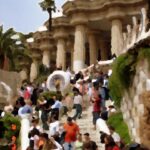
Fig. 15a: Parque Güel by the architect Gaudi in Barcelona, Catalonia, Spain. “Color paper collage”

The blurred image captures the lively bustle on the stairs just as well as the massive yet playful column construction.
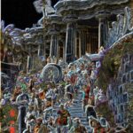
Fig. 15b: How does it look in the display with our difference program?
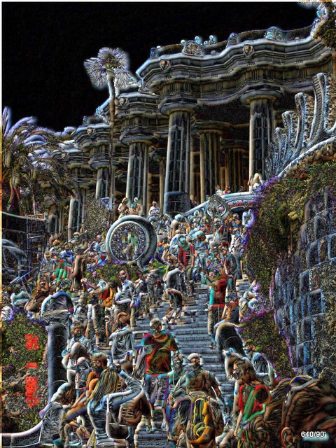
Slight Gaussian blurring and a very slight displacement downwards and to the right.
The parameters mentioned result in fine detail but a relatively dark image. In contrast to the above treatment, the “picturesque” is missing here in favor of a seemingly “graphic” interpretation. We find the strong emphasis on the spatial component “daring” – in a positive sense.
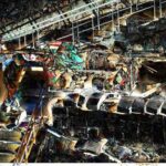
Fig. 16a: Barcelona. Work in progress with “painting knife”
The massive reduction is evident from the compressibility: this image hardly loses any information even when the storage space is minimized.
Despite or perhaps because of the processing, the characteristic impression of an urban landscape remains: rigid buildings in the background, brought to life by the people acting in the foreground.
Fig. 16b: What does this urban scene look like with the subtraction program?
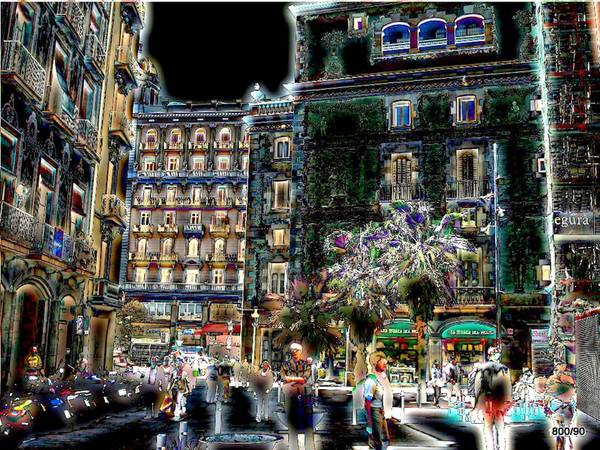
The detailed structure of the buildings is strongly emphasized, among other things, by the radical blackening of “street and sky”. The eye-catcher
– the people in the foreground and the palm trees – remains.
Unfortunately, one does not have the impression of sunlight but of artificial lighting.
Fig. 17: The Ladies of Arles/France. Subtraction.
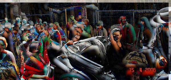
A municipal procession at the “feria”. Our editing as the difference between two almost but not completely identical images.
In the original, an ugly construction fence disturbs in the background. This is completely suppressed by the processing.
The people look idiosyncratic and unreal. The masquerade is emphasized and becomes a caricature. The scene is dominated by a lively spatiality and radiates something unreal.
Fig. 18: Chinese market women on their lunch break (Hainan Island)
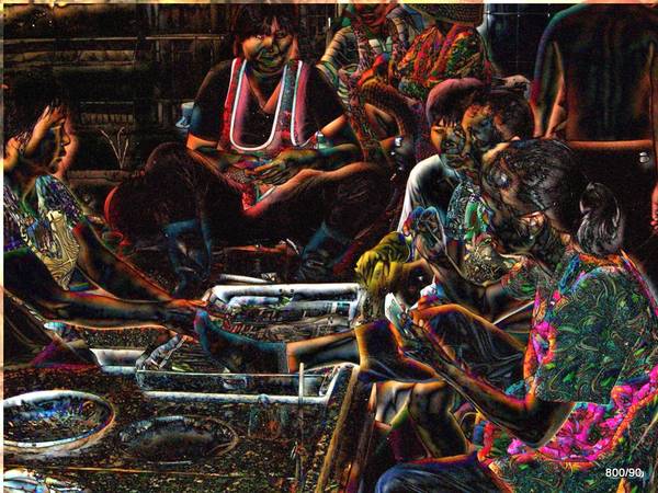
Our program: Relatively strong Gaussian blur, but only slight displacement (down and to the right).
There is a strange contrast: While the scene sinks into the darkness of a back room, structures appear – some of them very distinct – in the faces and clothing of the women involved. Despite the mundane nature of the scene, there is something mystical about it.
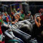
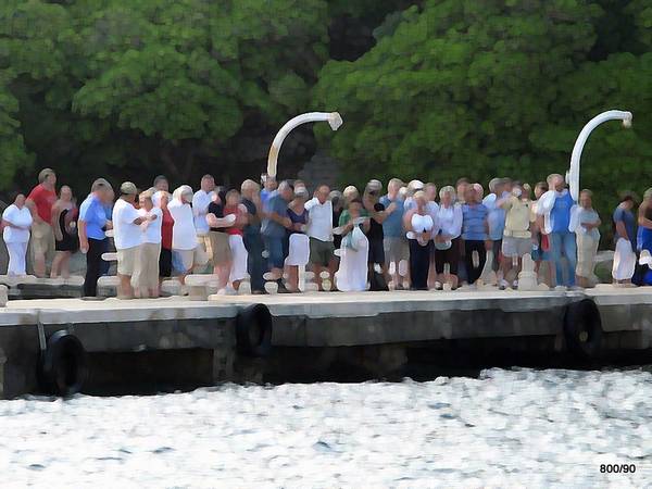
Fig. 19a: Expectation of the arrival of the boat (Dubrovnik / Croatia)
Commercial program “Oil paint spotted”.
The inhomogeneous crowd is well captured; it acts as a living wall and stands in contrast to the dark background and the clumsy harbor wall.
Fig. 19b: How does the motif look with our processing?
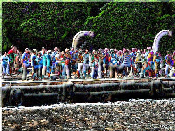
The personal features are preserved; they are even emphasized.
The colorfulness is undoubtedly artificially accentuated.
More structure in the water and in the background could distract from the main motif of the crowd; that is why the “backdrops” are kept quite dark.
Unsere hier dargestellte Bearbeitung lässt viele Fragen offen.
Wir glauben, dass diese optische Interpretation das Thema “harte Arbeit” besser schildert als eine realistische Ablichtung; dass sie den Betrachter in Anspruch nimmt und herausfordert.
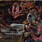
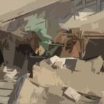
Fig. 21a: Work on the Nile bank; technically even more alienated but also interpreted.
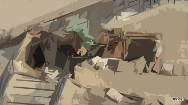
A completely different treatment of the same original with a common program: “paper collage”.
The presentation is fundamentally different compared with the original.
The people are no longer recognizable as such; they merge with the irregular stones.
Can such a reality-alienating image processing be artistically meaningful?
Can the viewer guess that this is not just a bizarre surface design, but is in fact dealing with a very specific topic? There is no doubt that the imagination is challenged.
Fig. 21b: Hard work on the Nile bank. Subtraction technique
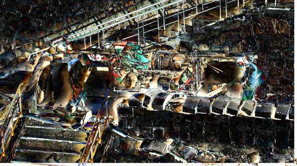
Our treatment of the subject as presented here leaves many questions unanswered.
We believe that this optical interpretation portrays the theme of “hard work” better than a realistic photograph; that it engages and challenges the viewer.
The authors would like to thank Mr. Matthias Popp for the competent design of the site.