14.11.25.
by Johannes F. Schmitt, Matthias Popp
Many thanks to Dr. Peter Krug / Reutlingen for his expert advice and help with the wording.
Read the instructions for your equipment regularly! The corresponding keywords are highlighted in red in the text.
The aim of this article is to promote the manual setting of the digital camera, because you can learn a lot by doing so. This should be done in an entertaining and easy-to-understand way. It should be made easier to find the relevant keywords in the respective operating instructions. Development will ultimately relegate such articles to the realm of utopia. The cameras that are integrated into mobile phones have such perfect automatic settings that no one bothers to use this blessing and convenience. AI never tires, but even the best AI is occasionally outshone by the human mind when it comes to photography.
In fact, there are already a number of good photography schools.
Every new article repeats a lot of old material, but also brings something new. Photography is like looking at a work of art: you can view the art from very different angles and always find something instructive and useful
I have several very good photographers among my relatives and friends. They choose their subjects well, always pay attention to plenty of shadows, and always give the picture spatiality through beautiful foregrounds and backgrounds. In any case, they get amazingly good results.
However, they – my exemplary photographers – tend to set everything on their digital cameras to “automatic” (also called “automatic exposure”).
With these lines, I would like to encourage you to often move away from the automatic and to remember the manual settings. Interesting aspects can arise, and unusual images can be created. This starts with a glance at the operating instructions, which we want to make easier with search terms.
My approach to photography is a bit unusual: I come from radiography. In radiography, one thing is completely different: light blackens the film, underexposed films are white. This rule also applied in the old darkroom. With digital photography, you could choose the optical result. Here, an agreement has been reached: exposure makes the image white. Overexposed images are white, underexposed black (see chapter 2 “Exposure”).
So in the digital world, we have completely moved away from the old film that was blackened by light.
Incidentally, with “digital radiography” you can also “choose” what is light and what is dark. When it comes to the image, people like to stick to tradition: light makes black. The opposite applies to fluoroscopy: if there is no patient in the beam path, everything is very evenly bright; if there is a patient, the radiation is attenuated.
Don’t think that you’re the only ones who have difficulties with this. We humans do many things right without understanding them. For example, many of us switch very quickly and intuitively when an image is displayed in black and white or white on black.
There are other peculiarities associated with X-rays: there are very different qualities of X-ray light, adjustable by higher and lower kilovolts (KV) and by filtering.
In photography, there is a nice phenomenon that X-rays do not have: focusing. It is one of the tricks used to give our (necessarily) two-dimensional image the impression (the illusion) of a third dimension (depth).


1. Focusing and (not to be confused with) depth of field (Figs. 1 – 10)
What is fascinating about photography is the possibility of “depth of field” or “sharpness of field”: optimal image accuracy is achieved at the set distance. This is also called focusing. This depth of field quickly disappears when parts of the object are closer or further away. Also pay attention to the sharpness display in the operating instructions.
The range in which the sharpness begins and disappears follows a pattern. You could also describe it like this: at what depth does the sharpness begin? Where does it start to blur?
The depth of field depends on the f-number, the focus-number.
For the aperture, you could actually specify the diameter of the aperture. However, it is made a little more complicated: you divide the focal length by the diameter of the aperture. At 2.8, the focal length is 2.8 times the aperture diameter.
This results in the paradox that a
large f-number with a small aperture,
corresponds to a small f-number with a large aperture.
Now to the relationship between aperture and depth of field:
A shallow depth of field results with a small f-number, i.e. a large aperture.
Greater depth of field is achieved with a higher f-number, i.e. a smaller aperture.
The latter small apertures often result in the image being sharp almost across the entire area, from front to back, so to speak. Most photographers like this, and the automatic settings naturally tend towards small apertures. No one then complains about blurred areas in the image.
But we want to be able to decide which depth is sharp and which is blurred.
Sometimes we want an image that is not sharp in all areas. This way, individual parts, e.g. the foreground, can be sharp and the background blurred. This draws the viewer’s attention in a certain direction.
It is also possible to blur the foreground and reproduce the background in detail. Such measures always enhance the image’s spatial impression. After all, we never perceive foreground and background sharply at the same time with our own eyes either.
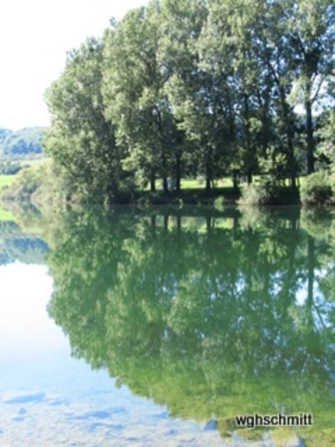
Fig. 1: “Oblique” photograph of a watercolor by Monika (see the article “Empty Walls”). The near and far portions of the object are clearly blurred; only the area in the middle distance is in focus.

Fig. 2: A maple tree in full shoot. The branches and buds in close-up and far away are blurred; those in the middle distance are sharp. It’s nice that the background is not only blurred but also takes on a relatively dark tint, providing good contrast.
Figure 1 shows this depth of field. It is an image of an image (of a colored sketch). The sharpness is in the area of the center of the image, the foreground and background are blurred. The area of sharpness was therefore chosen deliberately! This and the intentional blurring give the flat object spatial depth.
In the photography schools on the Internet, there are further nice demonstrations of this phenomenon.
In picture 2, a spatial impression is achieved in the tangle of branches. This is accomplished by individual branches moving into the area of blurring.
We want to make a statement with a photo. The view should be drawn to the interesting subject (person or object). Distractions caused by all sorts of irrelevant details, including junk in the background (and foreground), are therefore unfavorable.
Fig. 3: Iris by the pond. The sharpness of the flower is not ideal, but it is better than that of the background, which is clearly out of focus. It is a good thing that it is also relatively dark. This way, the sharpness and brightness focus the eye on the flower.

Fig. 4: The focus is on the flower, while the background is blurred, moderately so in the vicinity (green leaf) and quite strongly in the distance. To this end, the background is darkened, which is often a good idea.

Pictures 3, 4 and 5 show flowers that are highlighted by a blurred background. In addition, the background is darkened, which enhances the desired effect.
How can a large aperture (= small f-number) be set?
We have to get away from “automatic” and away from “AUTO” mode.
By mode, I also mean exposure mode. On my Canon Power Shot A710 (an older model), I have a dial next to the shutter button for the mode. ( = exposure mode)
Normally it is set to “AUTO”. However, I would like to encourage you to select a different mode by turning the dial, e.g. “Av”. This means: free setting of the aperture, e.g. 2.8 (i.e. a relatively large aperture).
For the purpose mentioned – to make certain areas of the image out of focus at certain depths – we naturally want to set the smallest possible f-number (largest aperture). The shutter speed is automatically controlled in this “Av” setting (aperture priority). The amount of light is therefore automatically compensated. This is done via the shutter speed.
The shutter speed is automatically controlled in this setting “Av” (aperture priority). The amount of light is therefore automatically compensated here. This is done via the shutter speed. An exposure problem can occur if the subject is so bright that no shutter speed is short enough to use this aperture. In this case, the subject should be changed by increasing the shadows (by pointing the camera more towards the sun or shooting from below). It is also helpful to get closer to the subject. This increases the difference in distance between the subject and the background, making it more likely that the background will be blurred.
This means: free adjustment of the aperture, e.g. 2.8 (i.e. a relatively large aperture opening).
For the purpose mentioned – to make certain areas of the image blurry at certain depths – we naturally want to set the smallest possible f-number (largest aperture opening). The exposure time is automatically controlled in this “Av” setting (time automatic). The amount of light is therefore automatically compensated for via the exposure time.
An exposure problem can occur if the subject is so bright that no exposure time is short enough to use this aperture. In this case, the subject should be changed by increasing the shadows (point the camera more towards the sun or more from below). It is advantageous to get closer to the subject. This will create a greater difference in distance between the subject and the background, making it more likely that the background will be blurred.
An exposure problem can occur when the subject is so bright that no shutter speed is fast enough to use this wide-open aperture. In this case, the subject should be modified by increasing the shadows (camera orientation).
It is a good idea to get closer to the subject. This creates a greater difference in distance between the subject and the background, making it more likely that the background will be blurred.
Fig. 4: The flower is in focus, while the background is blurred, moderately so near the flower (green leaf) and very strongly in the distance. The background is darkened, which is often favorable.
Fig. 5 Tulip. The main focus is on the flower. The leaves are “covered up” by blurring and merge into the darkness of the background.

What was said above about the sensible application of blurring applies here.
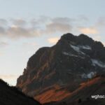
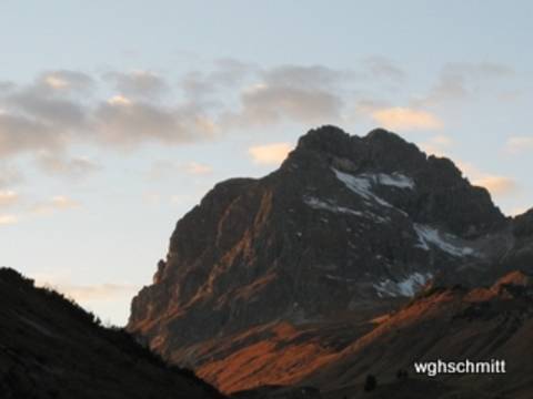
Fig. 6: Egypt. Flight over the desert.

Due to the lack of contrast, light clouds on a light background would be uninteresting. The image gains from the shadows of these clouds. Shadows are always significant!
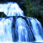
Fig. 7: Krka Waterfalls in Croatia. An impressive natural spectacle. Exposure time 1/60 sec
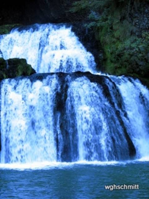
Fig. 8: The same motif. The exposure time of 1/10 sec. is six times longer. This blurring gives an idea of the temporal component.

Pictures 7 and 8 show another mode: “Tv”. It allows manual setting of the shutter speed. Now the shutter speed can be freely selected. After setting the shutter speed, the aperture is automatically controlled (aperture priority). You still have a convenient and usually correct image exposure.
Both pictures 7 and 8 show a waterfall in the Krka National Park, one exposed at 1/60 and the other at 1/10 of a second. Even at 1/60 of a second, which is not a particularly short exposure time, the water appears to be frozen in its momentary state. You can almost see the individual droplets.
Some photographers do not appreciate such pictures because they, so to speak, “cut out” fractions of milli- seconds.
To capture the “time factor” in a picture can be done with a longer exposure time: at 1/10 second, the water is blurred and conveys the character of the flowing water masses. *****
A famous engineer was inspired by this sight: Tesla built one of the first power plants here, even before his famous project “Niagara Falls”.
Fig. 9: Figure at Wildberghof (Mittelfranken). Artificial light and no flash; this can be seen from the wall lamp.
Exposure set to automatic. This makes the walls shine so brightly and distracts from the figure as the actual motif.
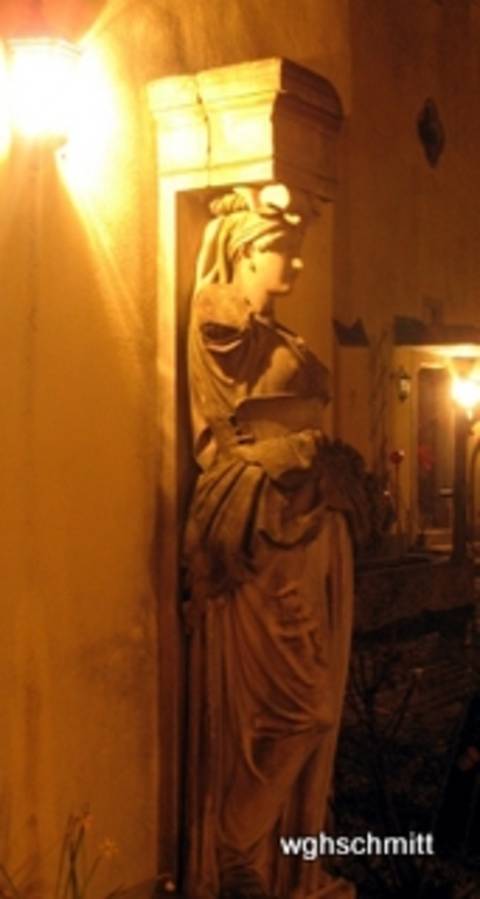
Fig. 10: The figure in the foreground is emphasized by flashing, the background is erased, the wall in the foreground remains a disruptive element; it cannot be optically eliminated in this way.
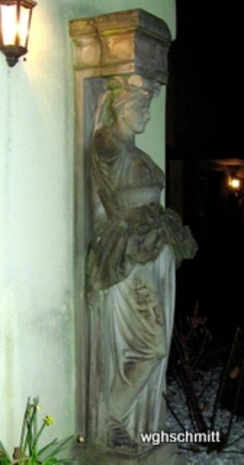
A classic tool for making the foreground bright and darkening the background is the flash. Also try with automatic flash (on/off).
Picture 9 and 10 show a sculpture (1852 formerly Würzburg, Ludwigsbahnhof) today on the Wildberghof near Uffenheim in Middle Franconia.
What does it look like when you use the flash?
The special thing about a flash is that it only strongly illuminates the closest objects, only a few meters away. Using a flash makes it easy to darken the background. Because the background is far away, the light has lost its strength there, and only a small amount is reflected. The figures, on the other hand, are intensely illuminated.
The wall on the left side of the picture is still disturbing. With a modified and improved image setting (image detail), a disturbing object can be removed from the field of vision; for example, a group of people can be freely positioned.
Many photographers are critical of the flash, especially when it is used carelessly.
For one thing, it is quite ridiculous when someone tries to use a flash at a greater distance. In that case, the flash is completely useless. It is also unprofessional to use a flash on objects that reflect strongly, such as an oil painting.
Dose = The Amount of light (– Fig19)
Fig. 11: The following 10 pictures deal with the dose. Here the exposure is correct; the chapel stands out brightly. The background recedes due to darkening and slight blurring; this gives the picture its spatiality.

Refer to the operating instructions more often. Suitable search terms are highlighted in red in the text.
As has been made clear so far, exposure depends on exposure time and aperture size.
Both determine the dose (in X-rays, one would say; photographers prefer to say “light quantity”). If you increase either the time or the aperture, the dose increases.
If the dose is to remain constant, time and aperture are inversely dependent: shortening the time requires enlarging the aperture, and vice versa, assuming the dose is not to be changed.
You can quickly achieve a suitable dose with “automatic” mode (see picture 11). The “image-important” — here, the chapel — lights up brightly. Foreground and/or framing the image are helpful for creating a sense of space. A slightly darkened background with muted colors is also favorable. The atmosphere weakens the colors in the distance. Nearby mountains are green or blue, while more distant silhouettes become increasingly gray.
Searching for the right dose is more complex in “manual” mode. Some say it is a game of chance. Often, exposure series are useful. Examples are shown in this article.
Fig. 12: The Doubs river in the French Jura. Variation of shutter speed at the same aperture. Here 1/640 sec: high contrast, not too many bright areas but some quite dark ones.
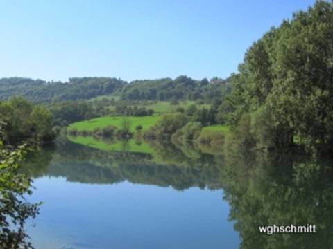
Fig. 13. The same motif. 1/125 second. Aperture constant, unchanged from Fig. 12. The amount of light = dose is considerably higher; plenty of very bright areas give the impression of abundance, calm and summer heat.

In images 12 to 19, the aperture is kept constant in each pair of images, the exposure time was varied. The “M” mode (= manual setting) allows you to select both parameters freely.
There are pairs of images in four examples with slightly shorter and slightly longer exposure times. This corresponds – with a constant aperture – to a significantly larger dose = amount of light.
As expected, the image with the shorter exposure time (on the left in each case) is darker. This is most noticeable in the darker areas of the image, which lose structure as their blackness increases.
The images with the slightly longer exposure time (on the right) are brighter. The brighter areas of the image turn very white and lose their detailed structure.
Which of the two images in each pair do you prefer? This is an aesthetic question, and there is no absolute answer. In most cases, I prefer the darker image and appreciate the method of reducing exposure by manual adjustment. In these examples 12 to 19, this was done in the following way: the shutter speed was changed while the aperture remained constant.
Fig. 14: Another motive of the Jura 1/250 sec. exposure is suitable for both bright and dark areas of the image.

Fig.: 15 1/125 seconds. Aperture unchanged and constant! Significantly higher amount of light = dose. Sky and water featurelessly bright. Impression of summery light and warmth.
There are other ways to control exposure without leaving it to the automatic system, namely:
In mode “P” the aperture and shutter speed are set automatically. But one of the special features compared to “AUTO” is the brightness correction. This can be easily adjusted with the +/- button (on my Canon Power shot next to the display, on the left above the function dial). Pressing “-” reduces the measured dose: the picture becomes darker; pressing “+” increases the dose: the picture becomes lighter! *
Another way of varying the exposure works by pressing the shutter release button gently. The measured exposure using previously selected image elements can be captured by pressing the shutter release button gently (not in “AUTO”) and is also retained if we change the camera position.
For example, you can measure the “bright sky”: In this case, the measurement indicates “there is a lot of light” and exposes less. (Classic example: when measuring the sunset, the foreground turns black and is illuminated in the style of a silhouette).
However, you can also measure the exposure on a dark, nearby object and save it: there is a lack of light and the exposure time is extended. Everything becomes brighter.
It is important that you can fix and save a certain exposure and that you can still change the viewfinder image afterwards. So you can set the exposure to a certain area of the image. Accordingly, other sections will probably be very bright (not so nice) or very dark (which can be interesting).
However, this does not work in “AUTO” mode. This is important information.
“AUTO” mode prevents me from metering the light where I want!
Abb.: 16 Kantabrische Berge (Nordspanien). 1/1250. Blende 5,6. Dunkle Bildareale sind so dunkel, dass sie strukturarm werden.
16 b: Aperture 5.6; thus more dose: Brighter image areas are too bright and lose (thereby) structure.
Short insert: There are different metering areas for light metering. There are older and more modern methods of configuring such metering areas.
For a long time, average integral metering was considered modern for digital cameras. The light metering is done over the entire image, with the areas in the center of the image being weighted more heavily. Recently, other methods of light measurement have also been available, e.g. selecting a small (rectangular) image area or linking several.
So there are several ways to capture the same subject in different exposures. This way, a whole series can be created from the same subject (exposure series). This is good photographic practice.
Fig. 18: Last of four example pairs with constant aperture but varied exposure time. Warth in Austria. 1/250 sec. f-stop 4. The image shows a high-contrast cloud structure and the gloomy, rejecting character of the mountain.
Fig. 19: Slightly longer exposure time (1/60 sec) and unchanged aperture: the mountain landscape appears somewhat friendlier and warmer. The cloud structure recedes.
3. Where does the light come from? The back light? (Fig.20 -30)
Read the instructions more often: suitable search words are in “red” in the text.
This chapter is about the question “Where does the light come from in a picture?”
What are the special features of a backlit photo?
The question of the position of the light source(s) is often underestimated by us amateur photographers.
Photographs of objects, e.g. works of art, are characterized by two types of positioning: the position of the object in relation to the camera and the position of the lighting.
As for portraits of people, they rarely look straight ahead at us, like a passport photo; faces are also less often shown by artists in profile. The half-profile is preferred: the head turns slightly to one of the sides.
How the artist arranges the light is not an easy question. I suggest that you, dear readers, pay attention to this the next time you visit a museum. Analyze every picture: Where does the light come from? It gets quite difficult with diffuse light
In photographic portraits, multiple light sources are often used. With practice, even these complex lighting situations can be analyzed. This article focuses on simple objects and simple exposures.
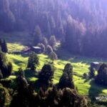
Fig. 20: The question with all the following pictures: Where is the light coming from? From the viewer’s side, slightly to the left. Hence the shadows on the trunks and branches on the right. Overall, a good spatial impression.
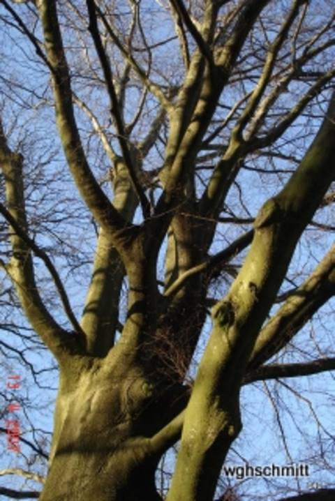
Fig. 21: Winterhausen, a little village near the river Main. Incident light from the left, largely tangential to the wall. The intense shadows create a beautiful spatial structure.
Picture 20 shows a tree trunk with its branches. The source of the light is clearly on the viewer’s side, or more precisely, slightly offset to the left. The branches of the trunk on the left edge are brightly lit, while broad shadows form on the edges on the right. This difference in brightness across the sides creates a strong spatial impression. Such a position of a light source is more interesting than one that is exactly on the position of the viewer. (Even pictures taken with a flash are better when the flash is held slightly to the side of the camera.)
The message of this simple object in Figure 20 is: Shadows are the source of a high-contrast and thus spatial image impression! An image is always “flat” = only two-dimensional. If a three-dimensional impression is artificially created, we perceive it as “beautiful”.
Conclusion: “Search for shadows” and/or “create shadows”!
This can be achieved by choosing a suitable camera position and/or positioning a light source appropriately.
Even in a simple framework, as in Figure 21, a lively play of light and shadow can be created. The sun shines almost tangentially to the house wall, from above and from the side. The fact that the right part of the picture is in the shade draws attention to the middle and is not a disadvantage for the overall impression.
Fig. 22. Cobblestone pavement; where is the light? Shadow of the far edge, light edges near the viewer. So “with the light”.
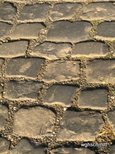
Fig. 23: The stone pavement again; where is the light? The edges close to the viewer are particularly black, the stones reflect, the spaces between the stones are much lighter. So, backlight!

Cobblestones (Figures 22 and 23) are used to demonstrate “light from behind” and backlight.
To solve this puzzle, ask yourself: Where do these cobblestones have the clearest shadow in each of the two pictures? On the side facing the viewer or on the side facing away?
Conversely: in which of the two cases are the spaces between the cobblestones better illuminated? In the case of the light coming from the camera. Here you look, as it were, into the spaces between the stones.
In which case do the cobblestones light up more brightly? In the backlit case they light up, as it were, reflectively.
Which picture requires a shorter exposure time (smaller aperture)? Definitely the backlit picture. Sunlight is reflected directly into the camera by the stones and is not just diffusely scattered.
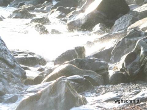
Fig. 24: Capo finisterre. Different exposures. First, automatically measured on the bright surf foam: 1/125 second. Aperture 5.6. This is sparingly dosed, creating dark stones, light, but not too light water, thus a good spatial contrast.
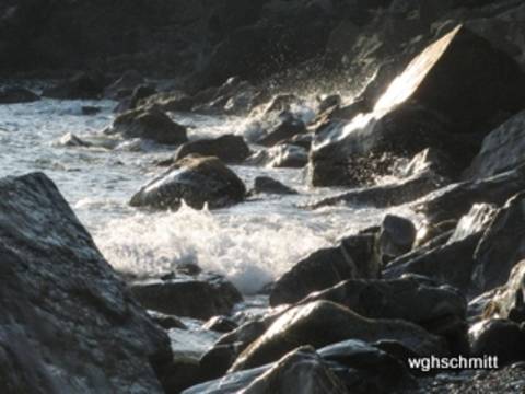
Fig. 25: Exposure measured on the stones. Here the automatic system “allows” a higher dose: light image areas, even too light, and thus a loss of structure occurs.
We are in the middle of the topic “backlight”.
The classic is the “sunset at Capri” and the fishermen shown as a silhouette, lowering their nets (and hopefully only the nets) into the sea.
The automatic reacts with such a motif: there is so much sun here, the “opening of the shutter” has to be switched off early and a low dose has to be provided.
This is enough for a moderate reproduction of the evening red sky. For the fishermen and their boats, it is only enough for a (dark) silhouette-like representation.
In short, backlit shots are often underexposed (, too black; at least in the foreground). This may be desirable because it creates interesting effects. Most of the time, you will want to switch to a larger amount of light. But you also need to know the various ways to deviate from the automatic exposure.
(Moving the metering points, e.g. by panning the camera and holding it with a light press of the shutter release, or by purely manually setting the parameters)
Using the example of a rocky beach (pictures 24 and 25), the dose is varied using this exposure measurement. So to speak, “semi-automatically”. It would also have been possible to vary the dose purely “manually” (via the aperture or the exposure time or a combination of the two).
Image 24: Measurement in the bright area within the foaming surf; correspondingly, the stones are dark and heavy. The exposure is reduced here, but not so much that these stones lose their spatial character and only appear as silhouettes.
In picture 25, the exposure is adjusted to the dark stones, which now become “gray in gray” and lose their spatial character. On the other hand, the foaming water is robbed of its internal structure by the intense brightness.
A completely new question now arises: Which picture do we prefer?
Guys! Tell me, what do you think of my post? It’s nothing new. But I think it’s been summarized concisely and accurately.
Incidentally, I prefer the first, the “underexposed” image.
Fig. 26: Tree trunk with biochar, backlit. A light stripe can be seen on both edges. The dose is large enough for the trunk to show structure and not just appear as a black silhouette.

Fig. 27: Okertalsperre in the region of the Harz-Moutain. In the backlight, trees and bushes light up brightly. The image thrives on the contrast to the dark background.

The mossy tree trunk in Figure 26 is – in contrast to Figure 20 – backlit; typical of this backlighting are the light edges on both sides of the contours. The object obscures the light source (sun), so that the exposure is not unduly suppressed even with automatic metering. The result is not a black silhouette, but the mossy surface structure of the trunk with its narrow light edges.
It is also pleasing that the background is in shadow and shows structural blurring.
Fig. 28: Backlit shot. Decorative, wafer-thin flower fibres light up. 1/800 of a second. Aperture 4. Such an image must not be overexposed too much, though, so that the background remains dark and provides good contrast.
Fig. 29: Posterior Rhine, above the Via mala. Backlit shot. Typical stray light and “spots” caused by lens reflections. Despite these artifacts, the richness of contrast helps to create a spatial impression.

Figure 28: Finer structures light up brightly when backlit, which can be particularly useful for fine, loose structures, such as flowers or grasses.
When shooting against the light, the sun does not always have to be on the horizon. A low sun also provides interesting images, often with extended, low-texture shadows (in which information is of course lost) combined with brightly lit subjects.
Figure 29 shows some backlight-typical artifacts: hexagonal surfaces (lens reflections = lens flare, see de.wikipedia.org/wiki/Lens_Flare), plus other elongated stripes emanating from the sun. The artifacts can be reduced by using a tube **, a lens hood or a lens shade. Stray light on the lens can also be blocked with the hand (and additionally with a flat object). This hand is then missing to fix the camera. So you have to learn to fix the lens with your thumb and index finger and to cover stray light with the palm of your hand and the other fingers.
The artifacts in Figure 29 are not always disturbing; they can add artistic interest to the image.
Fig. 30: View from a balcony in the mountains. Typical backlit effects with high contrasts. The background is softened by blurring and darkness, which enhances the spatial effect.

Backlit photos (Fig. 30) have a certain fascination. They create the illusion of “spatiality”; it is the old dream of stepping from the flat two-dimensional image into the third spatial dimension.
Admittedly, with backlighting in particular, data in very bright or very dark areas is leveled. It is electronically set to zero or leveled by low storage capacity. “JPG” as the standard format for most digital cameras offers very space-saving documentation and thus also quick playback and viewing of our photos without wasting time.
This article also contains only jpg images. The disadvantages that are accepted are the above-mentioned losses in the area of extreme exposures. Here JPG makes savings that are lost for further image processing. This is not the case if you save raw data (“RAW” = raw). Here, unprocessed data is stored on the memory card with a large storage requirement. Digital post-processing takes time and effort, but it is worth it.
Regularly refer to the operating instructions: Suitable search words are partially marked in red in the text.
And now, have fun with your new photo knowledge while taking your special pictures.
Footnotes:
* The “P” mode is very important when photographing analog X-rays. These are inherently black in large areas. The automatic system miscalculates the exposure by setting it too high. This results in a photo that is too bright. A few plus corrections help with the exposure! Shorter exposures have the side effect of reducing the possibility of blurring. I take all photos of old X-rays and all photos of art by hand, without a tripod.
** Such lens shades, tubes or “tubes” are also used in X-rays, but for completely different reasons. Here they are designed to absorb stray radiation that would otherwise affect image quality.
*** Portraits or group pictures taken against the light are problematic, as they are usually very underexposed. (Therefore, it is better to have light from the side or “with the light”). The picture is reduced to a silhouette when backlit. Exposure metering in the important areas of the image helps here, and optimal brightness is then achieved in these areas. However, there is a risk that other parts of the image will be very bright. In addition, a so-called fill-in flash is helpful. It highlights the foreground with an additional dose of light.
**** Besides the importance of aperture and exposure time for the amount of light, the set sensitivity of the camera plays a crucial role. It is comparable to the ISO value, i.e. a value for converting the light intensity into the language of the memory.
If the light is insufficient or if you deliberately want a long exposure, you need to think about an image stabilizer, a self-timer and a tripod. A wall, a tree or a Nordic walking pole can largely replace a missing tripod.
)
&description=&image=https://schmittbuxbaumscience.com/wp-content/uploads/2019/03/csm_06AEgypten_Wolken_und_Schatten_WGH_Schmitt.jpg_40656839f1.jpg)