


C19.12.25
Colored X- ray and colored black/ white photographs: Value?
Wolfgang G.H. Schmitt-Buxbaum, Mathhias Popp
We were inspired to write this article by the companies Bayer and Schering (both very active in the field of X-ray contrast agents).
A competition was announced on the subject of “contrasts”. As was to be expected, most participants submitted images in which gray values were converted into colors (gradient conversion).
Why this joy of color among a medical audience that is actually “black-and-white-oriented”?
The keyword “contrast” has aesthetic connotations. We understand it to mean something beautiful, something striking, harmonious opposites. We believe that contrast makes the invisible visible, illuminates the mysterious, explains the unimaginable. We instinctively believe that contrast opens up the third dimension even in flat images.
Secretly, we love color as a carrier of new insights, as something active and alive. Is that true?
It’s true, but not always!
Some imaging techniques worked with color in their early days and then limited or even abandoned it as they became more and more sophisticated.
A classic example is nuclear medicine, a discipline that has done crucial fundamental work for imaging.
The use of a broad color spectrum was and is obvious in this respect, as our “eyes” can only distinguish a small number of shades of gray, so it is reasonable to expect that a color spectrum would allow a larger number of image-specific values to be distinguished (a well-known example: thermal imaging camera).
For a long time, colored scintigrams were considered a must, until it was realized that “colors” can also cause confusion, namely when everyone creates their own color scales.
Our article deals with this gradual conversion from black and white to color. The procedure is simple; Photoshop is a very easy-to-use, popular program. And there are similar ones that are not bad. We did our images with Adobe Photoshop CS3 and can highly recommend this program.
We will not go into the many other, more complicated post-processing options here.
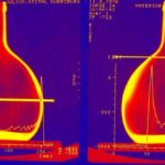
Our article should be generally understandable. Only a few passages require medical expertise. However, when it comes to stereo X-ray images, there are only a few who understand what we wanted.
We have edited both light and X-ray images. For the latter, we liked to use “old” ones because we are also interested in medical history.
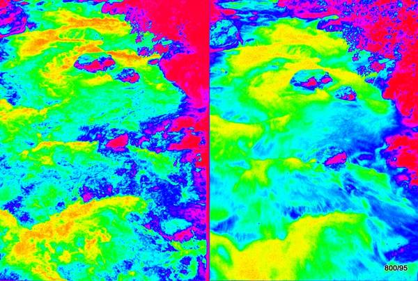
This is a collection of images. The order is sometimes somewhat arbitrary.
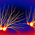
1. Artifacts, coincidences
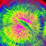
Fig. 1: Electrical discharge on a color film
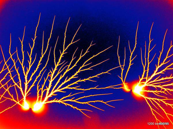
1. What is this?
A photograph, i.e. a light-optical image or an X-ray image?
neither one nor the other- yet there is a relationship
It is an electrical discharge immortalized on film, an art product, an artifact. The starting product, the film, is a classic black and white film. – Everyone who works with film hates artifacts. They spoil our intention to produce flawless products. In medicine, they can lead to misdiagnosis. That is why we have to learn to recognize and avoid them. As an intellectual challenge, they also have their appeal.
The branch is in the original black (on a light background).
The electric current triggered the chemical process in the film emulsion. It caused the film to turn black, just like light and other electromagnetic waves. It was only through the development process that the chemical reaction became visible as film blackening.
The translation into color took place in the second step:
From “light to dark” in the original,
during processing,
black to blue, violet, red to yellow and white.
This is a color chart. It does not tax our powers of imagination too much. The difficulty lies in the reversal:
light and dark are reversed in the original and in the color chart.
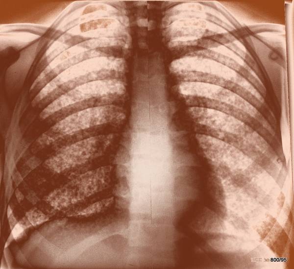
Two points should be addressed in brief for all of the following images:
1. Aesthetics?
Is it appealing? Yes! Absolutely.
2. Didactic value of the color scheme?
Low!
Collection value? Rarity? – Yes, to a limited extent. Under the old conditions of film development, this occurred/occurs more frequently.
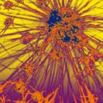
Fig. 2a: How did the discharge on the film occur?
2a. Based on the previous example, we show another mystery in the original, so without color processing.
Is it an X-ray, a light-optical image? Dead matter, a botanical structure, a part of the human organism?
None of these solutions apply.
It is an electrical discharge on a film, which emanates from a fingertip.
Figure 2b. Same image edited with color.
2b. One of the many color schemes, color gradient variations that a person can come up with.
Originally an electrical discharge that emanated from a finger tip and led to an unusually bizarre structure.
Color table only partially inverted this time;
light to dark is translated into yellow over red, dark blue to light blue.
The aesthetics are pleasing.
Didactic? Rather confusing. Too much at once. Often the original is more illuminating than sophisticated post-processing.
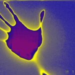
Figure 3. Light entering the darkroom.
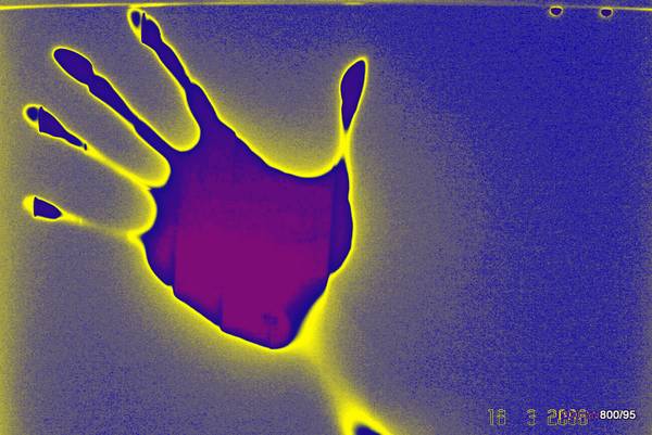
3. Someone was working with a film in the darkroom and noticed that the door had been opened briefly by mistake. Instinctively, he held his hand protectively over the film.
Developed, the film shows a total blackout, but an image (a shadow) of the hand. This is opaque to visible light (even in our radiography nomenclature, the attenuation of light is called a “shadow”. This is a convention, useful or not).
Everything is as expected.
Some fingers and the forearm are not in firm contact with the film and only cast a small “shadow”, are “thinned out”, so to speak.
What did we like about this picture (applies to all pictures 1-7)?
The casualness. It is the documentation of a coincidence.
The picture has no idea, no goal. Coincidence can be an imaginative artist.
How was “color” applied in retrospect?
Black is blue,
on the edge of black – that is, at medium blackness – it transitions into yellow; at lightness, the color transitions into blue and further into violet.
So it’s a complicated color scheme.
In this article, we ask two standard questions for each picture:
What does the color add in terms of information? Not much.
What does color contribute to the aesthetics? It reinforces the lack of intention, the chaotic character (an aspect that we find in pictures 1-7).
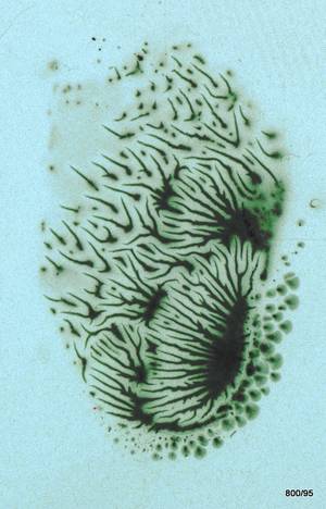
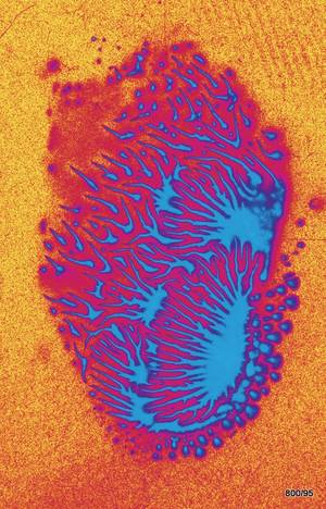
Fig. 4. How was this image created ? Defective film development ?
4. Es handelt sich um einen Film mit einer dicken Emulsion. Die Emulsion spielt eine Rolle.
Die Lösung des Rätsels ist schwierig, leichter zu ertasten als zu sehen.
Ein Weichtier? Ein Urstromtal?
Es ist ein Artefakt durch Schmelzen der Filmemulsion in einer defekten Entwicklungsmaschine. Den Artefakten möchten wir weitere Beiträge widmen; Das Wissen um bestimmte Arten von Artefakten ist mit dem Ersatz der Filmentwicklung verloren gegangen. Man sollte sich daran erinnern.
Artefakte treffen uns überraschend; sie haben nichts Geplantes, nichts Intellektuelles; es ist das Zufällige, das Überraschende, das Geheimnisvolle.
Bei Sofortbildkameras hat sich eine Art eigene Kunstform entwickelt, bei der mit Entwickler und Fixierer in das noch nicht ganz sichtbare Bild hineingemalt wird.
Hier: Farbverläufe von Grün über Blauviolett zu Violett.
Ästhetik? Unbestreitbar.
Didaktischer Wert? Gering.
Sammlung
4. It is a film with a thick emulsion. The emulsion plays a role.
Solving the mystery is difficult, easier to sense than to see.
A mollusc? A glacial valley?
It is an artifact caused by the melting of the film emulsion in a defective developing machine. We would like to dedicate further articles to artifacts; knowledge of certain types of artifacts has been lost with the replacement of film development. It should be remembered.
Artifacts take us by surprise; they have nothing to do with planning or intellect; they are random, surprising, mysterious.
A kind of art form has developed for instant cameras in which the developer and fixer are used to paint into the not-yet-visible image.
Here: color gradients from green to blue-violet to violet.
Aesthetics? Undeniable.
Didactic value? Low.
Collection value? A very rare observation, dedicated to the memory of the father and grandfather of the authors, H.G. Schmitt. He was a master at avoiding artifacts.
swert? Eine sehr seltene Beobachtung, die dem Gedenken an den Vater und Großvater der Autoren H.G. Schmitt gewidmet ist. Dieser war ein Meister bei der Vermeidung von Artefakten.
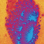
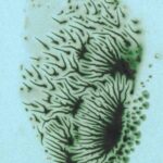
Figure 5. Strange structures in the bladder?
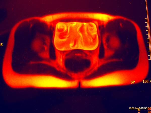
5. Apparently an MR image (magnetic resonance = nuclear spin tomography). The resolution was neglected in favor of the strange structures in the urinary bladder.
What is that in the bladder?
Solution: A flow phenomenon, the “jet” of contrast-enhanced urine from the ureters, creates spiral, wave-like structures in the fluid space of the bladder.
The color window changes from black-blue to red to yellow.
Aesthetics? The structure is so unusual that it draws attention to itself.
Didactic? No new information. Flow phenomena are also known from neuroradiology (cerebrospinal fluid). The phenomenon shown above can also be seen sonographically, for example, when the flow from the ureter into the bladder is very strong.
All in all, it is incredible that we see something that does not exist in “form” (?), but only as “function”. (We are similarly enthusiastic about color Doppler ultrasound!)
The virtual in the image? Or is every X-ray image, MR image, sonography image a virtual image? Something that did not exist in the world, that only came into being through the creative mind?
(Read more in Paul Gelinsky: the virtual in the X-ray image)
2. objects, light – X-rays
Fig.7. Snow on the roadside?
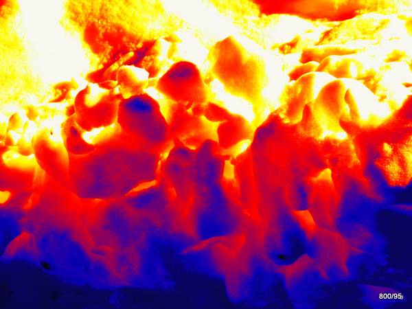
7. a simple motif. Its only peculiarity is the contrast.
This snow is partially illuminated and partially illuminated by the sun. Photos of transparent objects have a similarity to X-rays…
The contrast invites you to translate it into colors. These conversions may be easy or difficult to understand, meaningful or nonsensical.
Here is a window that makes it easy for the eye:
From dark to light; blue-red-yellow. It’s like a fire, only on the “cold” side is blue.
To make it even easier to understand, we have added a “black-blue” on the “dark side” and a “white” on the “light side”.
This image wants to retain the “unreal” and remain understandable. An artist would risk more.
Aesthetic? – Pleasing.
Information? – Little.
Figure 8. Electronic element of the waste. What method of imaging?
8) First, it was just an X-ray (in memory of David Hume).
Object: an electronic element from the trash. Size 2.5 x 1.5 cm, taken at 30 KV. What are KV?
X-rays have different qualities of light (not just different light intensities). The different quality (or let’s call it “type”) is defined quite well by KV = kilovolt = differently penetrating X-ray light. 30 KV is “weak”, “gets stuck easily”, but at least it makes “nice” contrast because it is attenuated (differently) sometimes very intensely.
The color translation makes the brightest image areas orange-red,
black turns violet.
In between, the colors go from blue to green to yellowish.
Aesthetic judgment? We like the picture.
Even if we don’t understand the information in this circuit, we do understand that someone has racked their brains to construct something that works. “Like” is a pale reflection of complete understanding. When we find something “beautiful,” we are just beginning to realize that there is a great idea behind it.
So we can like something even though we don’t understand it yet. That’s the teleology of aesthetics: beauty (which we feel) encourages us to explore the mystery, even though we will never understand it. Theology thinks similarly to this teleology. Is “Profile” helpful?
Fig. 9a. Original X-ray image before using a trick was alarmingly useless in terms of object recognizability.
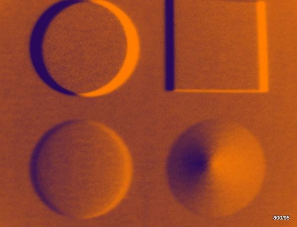
Concerning 9a. Four geometric solids in an X-ray image, but after a modification.
The X-rayed object had the great advantage that we could see it with our eyes. So we knew the solution. We wanted to know how informative the X-ray image is; it’s a disaster: one of the bodies looks square, the other three are indistinguishable, “dirty” round spots.
The X-ray image does not show that the three round spots are actually a cone, a sphere and a cylinder. So X-ray technology does a very poor job of this basic experiment!
What can be done to solve this logical problem with X-rays as well?
The (famous) “second level” provides the solution!
We did not want to go down this route, but an unusual solution that also leads to the goal is demonstrated:
the X-ray vision with two eyes.
We do not see the object from an angle changed by 90°, as in the classic “second level”, but from an angle changed by about 3° (as with the right and left eye).
If you subtract the two images, strange differences appear in the shadows of these objects. The result was shown in 9a.
A similar effect can
also be achieved by subtracting an image and a slightly shifted image.
We prefer the first method (small angle difference) for reasons explained in cases 28-30.
In any case, three of these four bodies are round; one of them is flat (= cylinder); one is a cone and one is a (half-)sphere. The fourth body is a cube.
The color scheme is dark to light brown, with little deviation from the black and white image.
Didactic? At least the mathematics behind it is important!
The coloring helps a little to memorize this mathematical object.
On the other hand, a picture that requires so much mental preparation cannot be much improved by color.
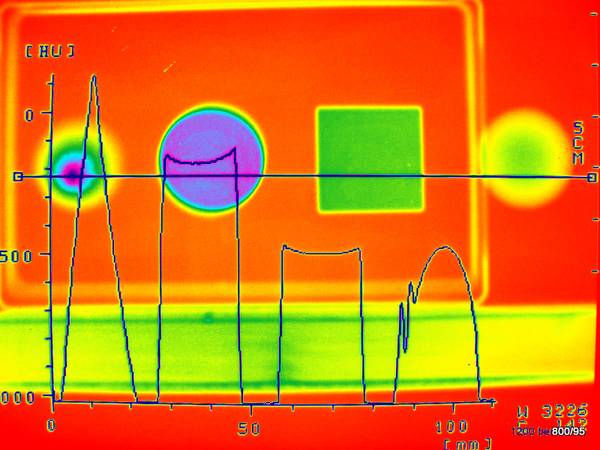
9b. The same objects as X-ray images. But edited with a more complicated color scale and with an automated evaluation: the profile.
We didn’t necessarily need this trick with the subtraction of two images; we could also digitally rework a single image.
Here we have arranged the four bodies slightly differently.
A “profile” is laid through the four bodies,
plotted: beam attenuation against distance. The result is called “profile”; it shows how the shape of the bodies differs.
Is it too much to ask of the reader that the whole thing is colored again? The color chart goes from
dark to light
red – yellow – green – light blue – violet – dark blue.
We also see it on this “colored” image in retrospect:
the cone on the far left, the hemisphere (or sphere) on the far right.
The purpose of the color? It is precisely this varied color scheme, which deviates from the black-and-white scheme, that could help to identify the differences between the original shades of gray. These were difficult to discern in the original. This subjective assessment can be disputed and the color scheme can be judged as nonsensical because it does not serve the purpose.
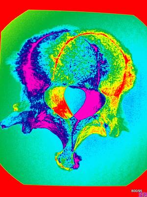
Figure 10. What is the shell sign?
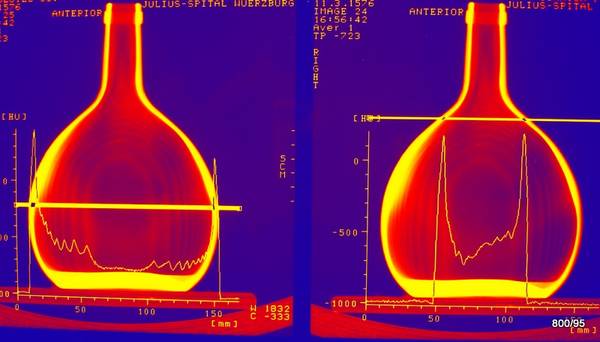
10. obviously a Bocksbeutel (Franconian wine bottle). Computer tomography or X-ray?
Somewhere in between. It is an addition of 9 CT slices. The summation of slices leads back to a summation-x-ray”;
the summation of a CT scan of a skull results in a nice X-ray of that skull).
It is clear what this image is supposed to show.
The shell sign (see also the next two cases 11 and 12, see “05 Pleura”):
The wall of a shell that is hit tangentially adds much more mass than the wall that is hit orthogonally. “Orthogonally” means that the beam hits the wall perpendicularly.
This phenomenon can be frequently observed in inanimate nature, in animate nature, and “so also in many areas of the human body. The strengths and weaknesses of the X-ray method can only be understood if you know the shell sign well (see our article 05 Pleura II).
The color translation is only used to make the phenomenon a little more interesting: from blue to red to yellow. This color chart is obvious; there is nothing mysterious or difficult about it.
Aesthetic evaluation? Brings life to the demonstration (?).
Diagnostic value of the color scheme? At best, it is minimal.
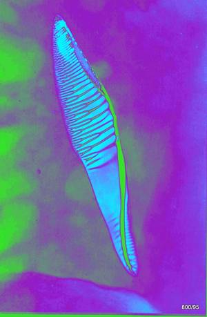
Fig. 11. X-ray image of the empty shell of a Roman snail. What is unusual about this image?
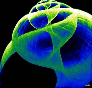
11. X-ray image, Film-foil combination, 32 KV (kilovolts), underexposed, low-dose, therefore (and because of the low pixel number) very noisy.
The answer: Color translation:
From dark to light
from black, blue, green, yellow to white.
Despite its apparent simplicity, this is an example of a color table that is already complex and demanding in terms of perceptual psychology. In the original, the bowl dominates: we see the chalk wall mainly where it is hit tangentially. The orthogonally hit wall is in the background in the original or is completely invisible. Not so in this color table: the sharp blue lines, e.g. in the helicotrema, are not as totally dominant as in the original X-ray.
The bowl, e.g. bottom left, is completely outshone in the original at medium exposure. Here, the slight attenuation of these orthogonally radiated shell parts is emphasized by the choice of window. Is that just an illusion?
Aesthetic judgment? A beautiful picture with insights into the architecture.
Didactic value of the color scheme? Relatively high; here the color scheme is not a gimmick, but helps with the demonstration.
Fig. 12. X-ray of a trumpet.
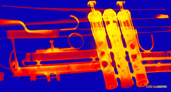
12. 90 KV (the sheet metal needs a higher KV number than a snail shell), film-foil combination (such dose-saving measures would be unnecessary here).
Classic color scheme (translation) from dark to light: blue-red-yellow.
A standard window that does not stray too far from the classic black-and-white impression; which avoids alienation.
The bowl effect (see 10 and 11) is impressively demonstrated, especially in the widening trumpet tube that can be seen at the top of the picture and further to the left. Certain sheet metal parts seem to be missing.
In the area of the valves, the intense dimming is caused by overlapping parts. The middle valve is dented. Is it a Bb or a C trumpet?
Aesthetics? Positive.
Didactic value of color? At best, slight.
3. nature, visible light and X-rays
Fig. 13. Fossil in limestone. Daylight illumination and artificial colors
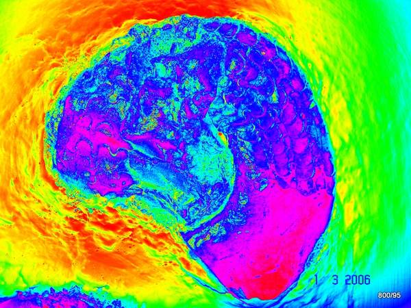
13. Photo of an ammonite from Gundelsheim am Neckar. Jurassic, 60 million years old (very young compared to trilobites and corals from the Devonian).
Color translation with a “rainbow from dark to light;
via red-violet-blue-green-yellow back to red – (explained in more detail at 19b).
Aesthetics? Good.
gain through color? The fossilization – embedded in stone – is well defined in color. Within the fossilization, the area of the air chambers (fault lines, a technical term from paleontology) stands out in color from the “living cavity” (red-violet). The coloring has a moderate didactic value, it is more of a gimmick.
Fig. 14. Original: X-ray of a thistle.
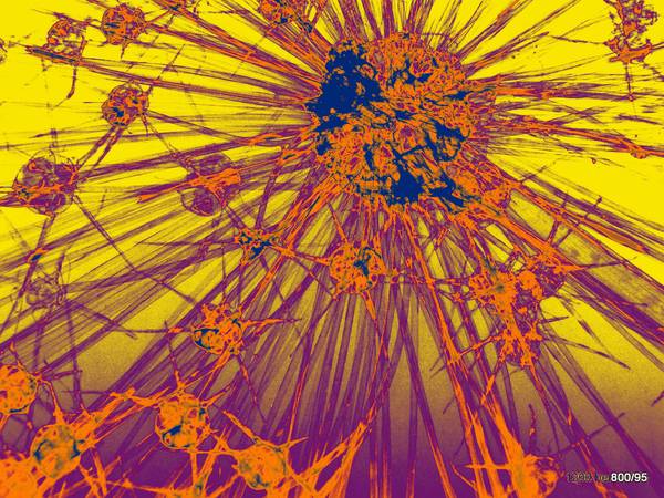
14. The dried plant material offered a low radiation attenuation at 28 KV (even at such a low KV!) and thus resulted in poor contrast on the film.
Therefore, the density differences were artificially increased by spraying the plant with an iodine-containing contrast agent. An old trick.
Again, the popular color transformation yellow-violet-orange-dark blue was performed. (20b, 27, 33a)
Aesthetics? Interesting.
Benefit from coloring? Surprisingly yes!
Whereby it is not quite clear whether this benefit came from the coloring or from the digital post-processing at all.
Fig. 15. What is this?
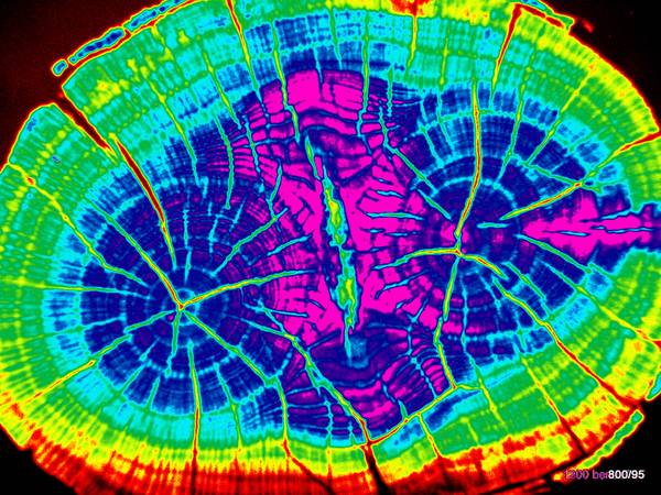
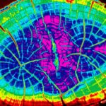
15. Cross-section of a tree trunk with two separated growth centers; (i.e. “cut” near a branch.)
What procedure was used for the cut?
A non-invasive procedure: computed tomography (CT).
The image quality is moderate. The examiner’s aim was to demonstrate the procedure, not to achieve a better resolution. For this reason, an unusually thick layer of 10 cm was set, 120 KV, 40mA (very low!). Especially with a dead object, it would have been possible to produce a “more beautiful” image quality with a very low layer thickness and a high dose.
The color translation follows a familiar pattern: from black to white,
from black to red, from yellow to green, via blue to violet.
If you know the color scale, you will better understand how the density of the tree structure increases inwards.
Aesthetics? Appealing, tending towards kitsch.
Information gain through color? Almost none. Rather a loss of detail structure.
Fig. 16. Based on an X-ray image. What is this?
16. Coral from our time, not a fossil (= recent). The object has a diameter of 20 cm and weighs 500 g. No layering technique but conventional X-ray 70 KV, 20 mAs (milliampere x sec), film-foil combination (would not be prescribed for an object).
Coloring from black to white =
black-red-blue-green-violet (somewhat unconventional in circles of friends of colored radiographs).
Aesthetics? Attractive, beautiful.
Diagnostic benefit of coloration? Almost none. For those who are not experienced in the evaluation of gray values, these colored images may make it easier. But only if they are familiar with the color gradient. The color tells us that the body is thicker/denser in the middle than at the edges.
( = summation effect; see our article “05 Pleura II”)
Fig.17. X-ray of a pregnant guinea pig.
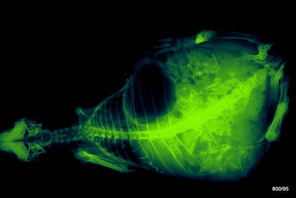
17th overview radiograph. i.e., a normal X-ray. 34 KV, film-screen combination.
As an incidental finding: pregnancy.
Color scale replaces white with yellow-green; black remains black.
A simple color scale; reminiscent of a fluoroscopic image from before the development of image intensifiers.
A real fluoroscopy image, however, must be imagined “inverted”: the dark areas “opalesce”; the bones cause real (i.e. black) “shadows”.
(In radiology, we use these age-old paradoxical terms: we call something very “bright in the image” a “shadow”; why, is explained in “09 Pleura II”).
Aesthetic? The coloration differs only slightly from the original, so the aesthetic appeal of the original is neither improved nor worsened.
Didactic value of the colorization? Low.
Incidentally, there is another article that deals with image processing (16). It asks: What happens when we subtract color from color? The results are complex and quite impressive.
4. landscape, architecture
Fig. 18a. Mountain stream. The left image and right image are identical except for?
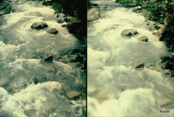
18 a. To study the effects of color changes, you need pictures; they don’t have to be X-rays.
Bergbach in Graubünden. Daylight. Left and right images are projected almost identically. But:
left exposure time 1/ 250 sec, right 1/ 2 sec.
The fast flowing water causes a distinct motion blur on the right with the long exposure time. How does this appear when using a color scale? See next pair of images.
Fig.18b: The coloring, although applied identically on both sides, also affects the visual impression
18 b. Since we know the original images, we know what the conditions are:
The color scale is identical: violet, blue, green, yellow, red. The difference between the right and left images lies not in the colors, but in the structure . The right image has calmer, washed-out contours. One could discuss why the upper right edge of the image is an exception to this observation.
Aesthetics? Not uninteresting.
Additional information through color? Not much.
Fig. 19a. Snowy landscape in the Upper Engadine. How has the color scheme been artificially altered ?

Color scheme: black, red, yellow, white. Some call it a “hot iron”.
Applied to a snowy landscape, this color scheme creates a paradox. The snow seems to turn into glowing sand. The branches, partly light, partly dark, appear excessively spatial due to the exaggerated contrast.
Aesthetic? Interesting.
Didactic? Such adaptations are not uncommon. Do they always lead to discussions about the broad field between art and “kitsch“?
Fig. 19b: Two people in the snow (Graubuenden, Grisons a canton of Switzerland).
19b. A failed snapshot through the windshield of a moving car.
Bad pictures are good for such post-processing: an opportunity to enhance something bad (even something low-contrast, something overexposed). The only good thing about the original is the strong contrast. Bad are the blurring and the artifacts:
° marks a reflection.
This color chart is much more complicated than the previous one. From dark to light: red, purple, blue, green, yellow, red.
This “rainbow spectrum” robs the image of its only beauty: the light-dark contrast, but gives it vibrancy (in contrast to the rather rigid landscape).
The colors turn a bad photo into an unreal, but sometimes lively poster. Admittedly, freedom reigns in the studio.
Is it “beautiful”? The “shock colors” are an “eye-catcher”.
Light and dark are destroyed and replaced by colors (only in the case of light to dark blue is some of the original black and white logic retained).
It is particularly paradoxical that red occurs twice: for very dark and for very bright. The red marked with * is a black shadow in the original. The red above between the mountains, on the other hand, means glistening brightness.
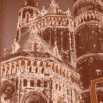
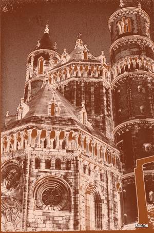
Pic. 20a: The cathedral of Worms on the Rhine ; West Choir. Source: photo taken in daylight.
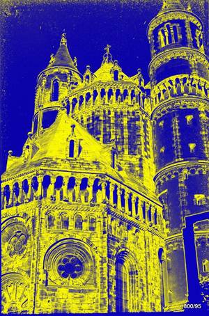
20 a. Application of a simple color table: blue-yellow-blue, i.e. very light and very dark areas of the image – sky and window niches – are shown in blue, and parts of the wall that are more brightly lit are shown in yellow.
The result is a mysterious visual impression that moves away from the very bright and luminous and towards the medium brightnesses. More precisely, a blue-yellow transition is created between two medium (but different) brightness levels.
The high side towers have a fairly light plaster after the renovation in recent years. This is suppressed in this gradient (= unobtrusive blue). Why does the north-west tower have a Gothic window? It collapsed during the Gothic period and was rebuilt.
The entire choir was in danger of collapsing at the beginning of the 20th century, but was recognized as a national treasure and restored with the “highest” support of the Deutsche Kaiser by a professor from Darmstadt. He hired a young architect, August Buxbaum, to join his team. When Buxbaum climbed the scaffolding and numbered the stones, his admiration for the building grew. During this time, he created his drawings of “reconstructions” of the city of Worms.
The façade, which has been depicted countless times, was presented to a large television audience once again in August 2009 as a backdrop for the Nibelungen Festival.
Aesthetics of the treatment? From an artistic and architectural point of view, this is debatable.
Fig.20b Same building, new Photoshop gradient, this implementation was already mentioned (14; 27)
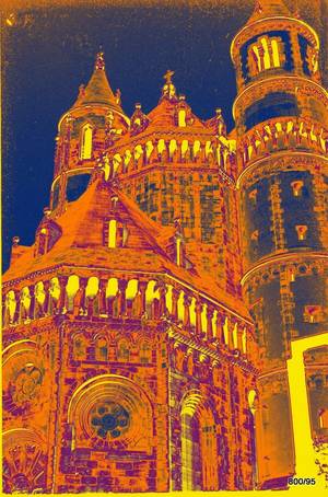
20b Color table: Yellow-Purple-Orange-Blue.
This gradient turns things upside down, distorting brightness and colors. The shadows of the building pop out in bright yellow, while the bright midday sky disappears into a dirty grayish blue.
The image suggests that the niches and windows are illuminated at night, including the mysterious openwork spheres on the conical roofs. However, this illumination did not take place; it is an effect of the processing.
The brickwork takes on a vivid structure between violet and orange.
Aesthetic? Remarkable.
Didactic: It encourages reflection on light and shadow, on the real and the unreal in image formation.
Picture 20c. A third color transformation of this cathedral of Worms
20c. This color chart was created by Photoshop with the name “copper”.
Starting from black, it goes through brown to light brown, then back to brown and finally to light. A provocation for all classical ideas of color and stone. It comes very close to the idea of shiny metal.
Between the brown tones there is a light colored stripe, and there are three transitions from light to dark. This creates a structural multiplication that resembles a strange reflection as it occurs on shiny objects. This is the stark opposite of a “silhouette” with its clear, razor-sharp black and white transition.
Aesthetic? Daring.
Didactic? Not without its interesting aspects.
Dear Readers,Please also note a further contribution (16) that goes a step further in the artistic “manipulation” of images. The keyword is “subtraction”.
Continue reading this entry on “Man, Light and Roentgen”
5. Man, light and X-rays
Figure 21: Sketch (black and white) before a special medium was added. Homage to W.C. Röntgen on the occasion of the 100th anniversary of his discovery in Wuerzburg 1995.
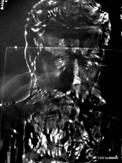
21b. Here you can see that it is W.C. Röntgen. The origin of the image is somewhat complicated. Felderhoff created the bust of Röntgen (several copies were cast in bronze).
WGH Schmitt Buxbaum (who works in close proximity to the place where Röntgen discovered the X-ray) wanted to create an X-ray image of Röntgen for the anniversary: 100 years of discovery. The bronze bust was made of metal that was too thick and dense. So he made a sketch on paper addingdiluted X-ray contrast medium. Now the contrast was a bit weak. So the paper was placed in the layer plane of a computer tomography device and an image of Röntgen was obtained using X-rays. It is very untypical for an X-ray image, since what is in front, the nose and parts of the beard, shine brightly, while what is in the back is in the shadow. These are “light-optical” criteria; they come from the draftsman.
Schmitt placed this picture at the beginning of his book “100 Years of Röntgen – 100 Riddles”.
At a ceremony held by the bavarian government in the Neubaukirche, this picture was also shown in the keynote address.
We also processed this image (21) with a color table. It was so bad that it could only have served as an example of unsuccessful coloring. It is not shown.
Fig.22. A photo of the vertebrae of a bowhead whale and a corresponding photo of a human being is the basis for color processing.
22. In each case, the 2nd neck vertebra (axis). Light-optical image. Then the color gradient image already familiar from cases 7, 10 and 12.
Do we often X-ray bowhead whales? Yes! – Seriously, though: although we humans are much smaller, we are very closely related to whales, and to countless other creatures as well. In some cases, we are much more closely related. Our appreciation of our fellow creatures should not be limited to collecting their vertebrae, carrying them somewhere in a backpack and x-raying them. And at the end, to take colorful pictures of them as if they were intended for an autograph book for whales and humans.
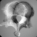
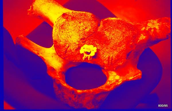
23a. Two human lumbal vertebrae L4 and L5 have dislocated through a rotational movement. The spinous processes are still aligned, as are the small vertebral joints, but the vertebral bodies have shifted sideways. Accordingly, the spinal canals no longer fit well.
There is wear in the small vertebral joints.
This is probably where the abnormal mobility comes from: the vertebral body of one vertebra can be twisted out to the side in relation to the other. The pivot point is located far back (dorsal), almost in the spinous process. The damage to the small joints also does not do the intervertebral disc any good; it wears out. –
Or the degeneration of the intervertebral disc was there first and caused the wear of the small vertebral joints and the pathological mobility.
To make it easier to see, one vertebra has been colored light and the other dark. How is that possible? One vertebra is shown as a positive and the other as a negative. The magic word is subtraction. Two vertebrae have not been added electronically , but one has been subtracted from the other: so one is light and the other dark.
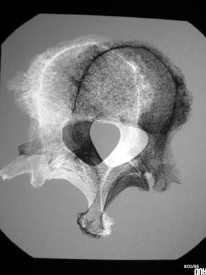
Fig. 23b: The same image, but post-processed: How does the “phenomenon of lateral instability”” appear when the original is depicted in a color gradient? Two human vertebrae L4 and L5 in a subluxated position, achieved by a rotational movement.
23b. the color table is quite complicated: black to white is translated/converted
red, yellow, green, blue, violet and back to red.
Aesthetics? Appealing.
No gain from the color. The initial image is too difficult, especially due to the different representation of the two swirls (one light, the other dark). The viewer is expected to process too much here. This is also a necessary insight.
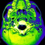
Picture 24: The human beeing is visualized again. Here you can see the (complex) base of the skull. Image of the interface between brain and body. Computer image with color transformation
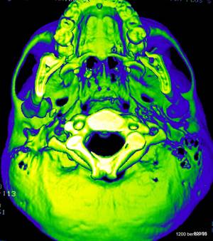
24. The examination is at least 20 years old. Is it an
X-ray or a light-optical image? Was the examination carried out on a human being or on the bony base of a skull? No one could say for sure without knowing the source images.
It is a computer product.
Images from a CT scan have been given the criteria of a “light-optical” image through data processing. The difficulty of the procedure is to determine a “threshold” between air and bone. The image is almost 20 years old in medical history.
Gradual transformation from black to blue-green-yellow-white.
Aesthetic? A good picture.
Didactic value of colors? Low
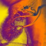
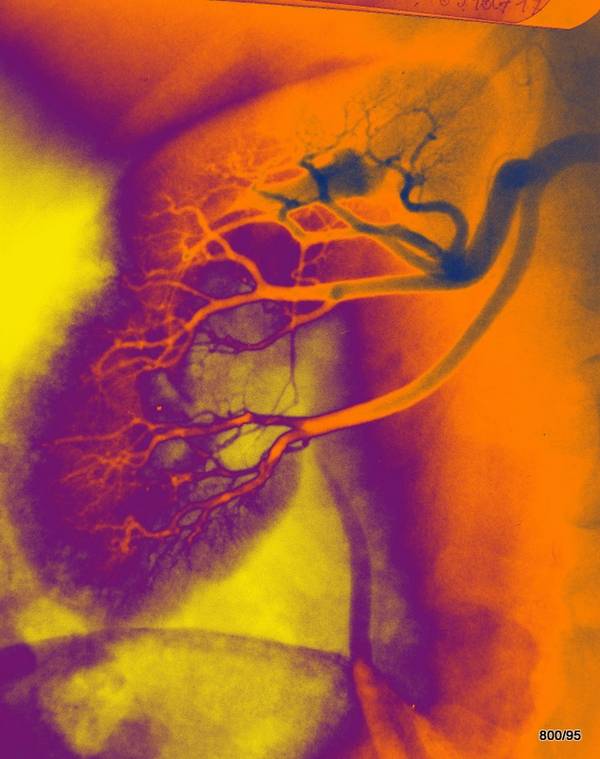
Figure 25: Which vessels in this pig heart have been X-rayed and are “discolored” ?
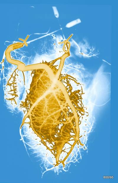
25. visualization of the (two) coronary vessels on a specimen of a slaughtered animal. This examination has a historical character. In his time, WGHS probably clamped the ramus circumflexus of the left coronary artery at a theoretical institute and only visualized the ramus interventricularis.
Color chart: light blue – white – brown – light brown,
so a “crazy” color window with an inharmonic jump from the weaker to the stronger colored myocardium and a relative suppression of the large coronary arteries, highlighting the small branches.
Aesthetic? Not without its charms.
Didactic? More confusing than enlightening. The information is at best: vessels are something fascinating.
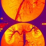
Figure 26: Where are we and what factor distinguishes the upper and lower picture?
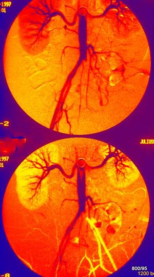
26. We are in the area of the abdominal aorta (with the renal arteries) that branches out in the pelvis. The two images were taken at different times. There are better images available, but these show what should be shown. A catheter was inserted via the right femoral artery. The catheter angiography was performed as a digital subtraction angiography (DSA);
i.e. subtraction is obligatory here in order to suppress the background (bones, etc.) and to emphasize the contrasted vessels. So, for each image, we need two initial images, a mask and a filling image.
What is wrong here? Shortly after the bifurcation of the left iliac artery (we are looking at the patient from the front), it is occluded. However, this occlusion is overcome with a long delay by small bypasses.
In the upper image, the empty image is used as a mask. The contrast agent is colored blue in this image.
Smaller branches, e.g. collaterals in the left pelvic area and the renal parenchyma are red in front of a yellow background.
In the lower image, it is not the empty image that is used as a mask, but a late contrast agent phase.
This makes the time factor very clear:
Late contrast agent image = yellow (renal parenchyma and
vessels filled via collaterals);
early contrast = blue.
Today, there are procedures (CT and MRI) that replace a significant portion of catheter examinations, i.e. they do not require a catheter. Ultrasound has also been enhanced by Doppler sonography and is extremely useful. For example, catheter access is still necessary for interventional procedures, which are very important.
Aesthetic appeal of the images? Appealing.
Didactic? Color can be helpful. Post-processing is always carried out when the examination is completed. Color is an additional attempt at presentation. In most cases, only a small additional benefit is to be expected.
Figure 27: The images shown are getting older and older. Catheter angiography of the right kidney in a 40-year-old patient from 1965. In memory of Prof. Günter Viehweger, Würzburg.
27. color-coded representation: classic yellow-violet-orange-blue-gray transition.
Aesthetic? Undeniably pleasing.
Didactic? The dilation of the vessels in the central renal area and a certain displacement of the large vessels are demonstrated.
The mass is a parapelvic cyst (located next to the renal pelvis), which is not malignant.
Today, less invasive procedures would have provided diagnostic certainty. It is highly likely that the case could be diagnosed and treated with the help of ultrasound (sonography).
Figure 28 Stereo X-ray of a bunch of grapes; approach according to WGH Schmitt-Buxbaum
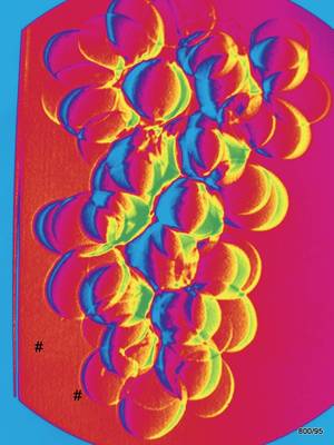
28 Sylvaner- grapes /Juliusspital/ Würzburg;
Stereo-X-ray in my modification. The foundation was laid years ago, probably even several times; e.g. by Friedrich Dessauer Aschaffenburg/Frankfurt/ Istanbul/Frankfurt.
Here in the subtracted X-ray image, the black and white values are replaced according to a color table. The novel idea lies in the subtracted image. The color is nothing more than a marketing gag.
The image is very demanding for the viewer. If we hadn’t taken the picture ourselves, we would have had difficulty explaining the mechanism by which it was created. Anyone who comes this far deserves the greatest respect.
If you think about it, you can see the following:
The fact that the grape berries are colored yellow on the right side and blue on the other side is completely atypical for a normal X-ray image, no matter how ingeniously colored,
and speaks for illuminated and unilluminated sides, something that is absolutely typical for visible light. But it is an X-ray image.
On the other hand, the yellow crescents on the right and the bluish crescents (shadows?) “to the left of the berries” are of different thicknesses.
And there is another paradoxical finding: some berries have a yellow shadow on the left side instead of a blue one.
What could this correspond to?
It is an image seen with two eyes. – This has something to do with “stereo”!
The object was examined (x-rayed) from two different angles and the two separately recorded images were combined into one.
One of the simplest methods of combining two images is subtraction. This is similar to the processes in our brain. The difference between the two images provides information in the third dimension. In our case, the information tells us which berries are further away and which are closer to the observer. Probably the berries with the broad yellow “crescents” are closer to the viewer on the right side, the further they are from the viewer, the thinner they become. In my book “100 years of Roentgen, a hundred puzzles” I admit that a few years after Roentgen, people were dealing with similar problems.
One reason was the search for shrapnel and fragments in the body. (see Ludwig Dessauer, approx. 1905). Madame M. Curie worked on the problem.
In our demonstration, the initial image, the black-and-white subtraction image, was colored.
After the rainbow: blue-green-yellow-red.
Aesthetic? Rather an intellectual challenge.
Didactic? Strongly demanding (the principle is explored in more detail in the following examples).
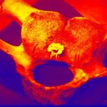
Figure 29: X-ray image of a hollow sphere made of sheet metal; the image contains secrets
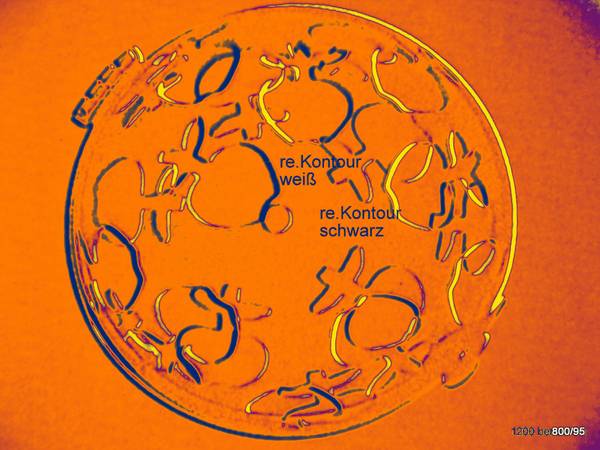
29. Ein komplexes Röntgenbild: Sowohl in die vordere als auch in die hintere Hälfte der Blechkugel sind Löcher in Form von Ap
29. Holes in the shape of apple symbols are punched in both the front and back halves of the sheet metal ball. On the right side, the apple symbols have a blue border, while on the left side they have a yellow border.
So far, we agree.
Strangely enough, there are also “apples” that have a yellow outline on the right side and a blue outline on the left side.
Do you have any idea what this could mean?
It is easy to create contours by subtraction.
FOR EXAMPLE: If you move an image of some objects slightly against the negative of that image (which is nothing more than subtraction), you get dark edges on one side and light edges on the other. We have shown this in 28 and we will show it again in 30.
In this case, the technique is a bit more sophisticated; it is not an ordinary displacement. We see the object with two eyes, which means that the angle is changed, and the intersection of the two central rays intersects in the middle of the object. That is, one eye shifts the upper part of the object to one side, the other the lower part to the other side (relative to the other eye).
This is not a subtle distinction, but a conclusive simulation of human “spatial vision”. And it is an excellent measuring method.
Just to make this experiment a little more friendly for you, dear readers, we have added a color chart. Now black turns blue, white turns yellow. Actually, it’s quite superfluous.
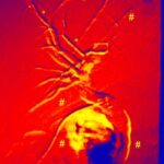
Fig. 30: Human bile ducts in and outside the liver.
Longing for the third dimension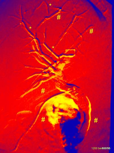
30. This postoperative presentation of the intra- and extrahepatic bile ducts was carried out with contrast agent via a lying drainage. The operation was necessary because of stones in the gall bladder, which had also settled in the bile ducts. The gall bladder was removed with the stones, the stones in the bile ducts were shattered; the examination should prove the absence of stones. The drainage could be removed.
Stereo images would be useful if there are good possibilities for viewing them.
Two images are needed.
These two images could be subtracted from each other.
If they were identical, the result would be “zero information”.
But since both images were taken at a slight angle, some bile ducts (#) have a light (yellow) contour on the right side and a dark contour on the left side. Let’s look at the right contour: however, there are individual bile ducts (*) with a dark contour on the right and a light contour on the left.
How can that be possible?
The latter (*) are further forward, the former (#) further back.
The large bile duct is also dorsally located before it enters the intestine.
The bile duct (ductus choledochus) releases its fluid into the duodenum: a large colorful spot appears there (contrast bile that has drained well).
What does this image reflect psychologically?
Our longing for the third dimension. This is often justified.
Normally, the X-ray image is a large “addition” from front to back; everything is above and below each other.
However, we want to understand the X-ray image spatially, even if this is difficult. It is also difficult because, for psychological reasons, we always project the light at the front and the dark at the back.
For example: there are people who, when looking at an overview of the pelvis, never understand the spatial orientation of the pubic bone, the ischium, and the pillars of the hip joint. You can only understand the overview image if you hold the bone in your hand. You have to free yourself from the rules of everyday light optics.
Of course, there are also methods that significantly improve the spatial impression. The layer techniques: CT, MR and sonography.
7. contrast agent, lungs, bones
Figure 31. Looking back 75 years; the history of medicine and its dark side
31. extravasation after pelvic angiography (vascular imaging) in 1949 with Thorotrast.
Extravasation or extravasation (one is Latin, the other Greek) is something that is not in a vessel (a vein), but next to it. It would not be too serious if it were not for the fact that it was a very dangerous substance. This substance has been banned for a long time, and it is certain that it has not been used anywhere in the world for 80 years.
Today, many of the problems associated with X-ray contrast agents have been solved.
At the time, the problem was that contrast agents with good acute tolerability had serious long-term problems.
This observation was made by H.G. Schmitt, which prompted him to issue another urgent warning about Thorotrast in a journal. Wachsmuth had already pointed out the dangers in Würzburg in 1948. The creator of this site is so old that he still heard the surgery lecture at Wachsmuth.
KH. Bauer in Heidelberg differentiated a little later:
– the thoracic Thorotrast granulomas,
– the general damage to the parenchyma, and finally
– the risk of cancer.
In contrast to local extravasation (as seen here in the image in the inguinal region), systemically applied Thorotrast accumulates in the spleen, liver, and lymph nodes.
The color chart violet-black-green-white highlights the paravasal extravasation and helps to memorize the image.
Fig. 32: Back to “conventional radiography”.
Duodenum dilated with barium sulfate and air in hypotonia (= double contrast).
Non-water-soluble contrast agent.
32. Only 20-30 years ago, X-ray examination of the gastrointestinal tract played a major role. Today, these questions are covered by endoscopy and the various sectional imaging techniques.
For a long time, this was one of the methods used to diagnose a mass in the pancreatic head (pancreas), or at least to try to do so. “Retroperitoneum” is the space behind the abdominal cavity containing the kidneys, pancreas and abdominal aorta. Although this method has been largely replaced by endoscopy and modern imaging techniques, we want to hear the diagnosis.
Pancreas anulare.
An anomaly of the pancreas that encircles and constricts the duodenum. Probably not a malignant tumor.
Aesthetics of this purple-red-yellow window? Appealing.
Didactic? It could be helpful to memorize this classic anomaly.
Fig.33a: The limits of color in diagnostics (see also case 21).
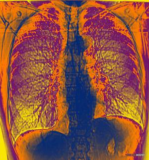
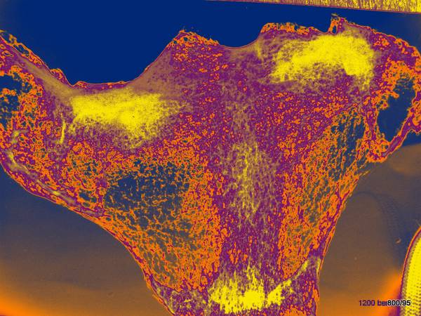
33a. Not a real thorax picture, but a “topogram”, also called a “scanogram”, obtained with a minimal dose;
i.e. an overview image from the CT (= computed tomography): the tube is stationary, the patient is moving.
Yellow-violet- orange- blue.
Once again, this bizarre window, which seems to show the vascular structure of the lung well, but at the same time displays the light regions in the thorax image with surprising transparency. These regions are the mediastinum between the two lungs and the upper abdomen.
Don’t be disappointed if you don’t see anything. Some professionals only notice the slight elevation of the diaphragm on the left and dislike the structure of the left lung root (hilum) and the structure in the area of the pulmonary artery segment.
All in all disappointing, especially if the original (33b) doesn’t give much more information.
Fig. 33b: Original of the processing of figure a
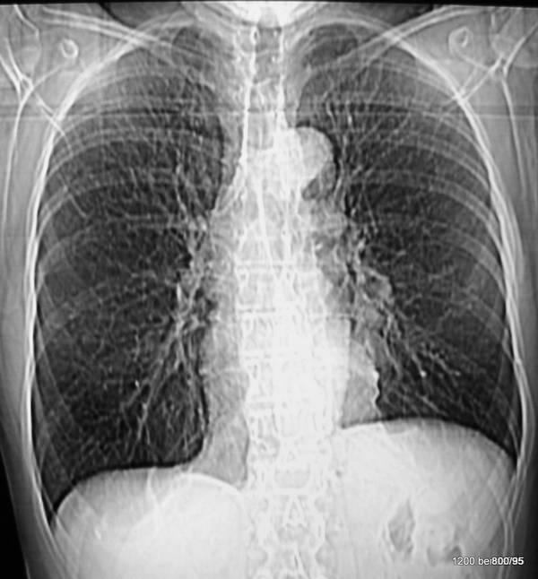
33b. Same case. In the original. (topogram = scanogram, although with a rough image matrix and very low dose), we have it easier than in the color processing. Foreign tissue projects onto the left hilum (lung root). The patient is correct in the CT that was started with this image. The mass is located more ventrally. If we were to perform the examination with the patient in a slightly raised right position (RAO), the mass would appear more pronounced; in the LAO position, it would disappear in the heart shadow.
Central bronchial carcinoma on the left with distinct ipsilateral lymphoma. Decreased volume of the left lung.
This was impressively confirmed by CT shortly afterwards. It seems that patients at high risk benefit most from CT. There are good articles on bronchial carcinoma (bronchogenic carcinoma, bronchial carcinoma, lung carcinoma), which is common and important, in Wikipedia. Also on the discussion; Is computed tomography suitable as a search method. The patient’s complaints are uncharacteristic. Cigarette smoking is the most important risk factor.
Diagnosis using an X-ray overview image is difficult. It is even more difficult for the more common central tumors than for those in the lung periphery (round foci). This is proven by the mirroring of the respiratory tract (bronchoscopy) with the possibility of tissue removal (biopsy) and lavage.
So the chest x-ray is poorly interpreted in this context. Nevertheless, it is very important for numerous other problems.
Fig.34. Now for something a little less serious to help you relax!

34. Thorax with titmouse
The thorax in the p.a. view belongs to one of the authors at the age of 11 years. The combination of the bird with the thorax is a computer product; it decoratively sits in front of the heart shadow.
Color scale light blue-dark blue-violet-red-yellow-green.
The color scale shows an asymmetry (compare the two lung tips), which is, however, artificial. It is not supported by any other arguments, such as a shift in the midline, scoliosis, etc.
A titmouse sits in front of the thorax, behind it some plant branches are visible.
Fig.35: Multiple fine spot shadows of the lung periphery
35. To return to a serious problem and also to demonstrate a (rare) didactic value of color, here is
a brown-white-brown window.
A chest X-ray from many years ago. It was taken with machine settings that are no longer used today.
Multiple spot shadows in the peripheral lung, which probably only become visible through the summation of the finest nodules in the lung tissue:
Milery tuberculosis. An especially severe form of tuberculosis in young people.
Didactic? Good representation of the lung parenchyma with its distinctive pathology,
weaknesses in the areas superimposed by the mediastinum and diaphragm. These would have been better with the hard-ray technique (over 100 KV), which was not used at the time and is mandatory today for radiation protection reasons.
Fig. 36 Sternum (breastbone), namely the uppermost part, the manubrium. Specimen. Radiographic overview.
36. Oblique projection. We look at the uppermost part of the sternum from the front right.
In addition, the central beam is tilted from the front top to the back bottom. Thus, we meet the right articular surface of the sternum clavicle joint tangentially. (If the examination were carried out on a living person, i.e. the clavicle is present, we would ideally represent this joint gap. One of the prerequisites for a good X-ray diagnosis of a joint.)
Color scale already known.
Aesthetics? Remarkably good.
Information through color? No decisive new insights. But the viewer gets a sense of the mysterious architecture of such (seemingly not so important) bones.